Windows 8 sports a spunky new UI, while Chrome OS gets an apps list

For the other three people using Chromebook, Google hasn't forgotten us. Whoo-hoo! The company continues to iterate Chrome OS, and with each rev takes it further from the cloud and closer to earth. I like my Chromebook, but even I shake my head and laugh at the amazing innovations. Well, they were in 1995.
Last year when first introduced to Chromebook, I worked solely in a browser. Now Chrome OS is this molten half-browser/cloud, half-desktop mutation -- like the two-headed creature from "The Thing". But the motifs are all ancient desktop OS, which is such a step back from the cloud-connected device era. Shouldn't Chrome OS move forward.
Meanwhile, Windows 8 struts around its modern UI -- the one once called Metro -- like a peacock courting hens. Microsoft looks ahead to the post-PC future in ways you would expect from Google. After all, storks took that baby to the cloud and kept it there. Post-PC should be the air Google breathes. So why is the search and information giant oh-so fascinated with making the operating system more like what Windows was 30 years ago?
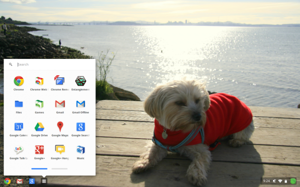
Chrome OS has a toolbar now. That's gone in Windows 8. Translucency is another recent Chrome OS addition, something Microsoft also booted from Windows 8. For the newest stable release, Xiyuan Xia, Google software engineer and Apps connoisseur (I want to see the business card), reveals yet another amazing new feature. Do you see the apps list/launcher in the photo? That's it, baby! Oh yeah, Microsoft introduced the similar Start menu with Windows 95 and replaced it on -- you guessed it -- Windows 8. There's an omnibox search box now, too. Well, Windows only has had universal search since XP, which brings Chrome OS into the 21st century at least. This from the company which core business is search.
The apps list isn't really new, just the presentation. Google introduced the feature with the last big Chrome OS makeover, which added loads of desktop-OS features -- and some of them are oh-so 1990s. You don't want to move around files on this OS, for example. It takes forever. I have Windows 3.1 flashbacks, the process is so traumatic. But back to the apps list: Google moves it to the cozy, pop-up menu from icons laid out on a desktop -- both, desktop motif and icons on top, being what 1980's innovations? Or where they 1990's?
The last Chrome OS update introduced Google Drive integration, which is anything but. There's no sync, which is available to Mac or Windows users. For an operating system that's supposed to be about the cloud, I expect much better from something as fundamentally important as cloud storage. Google Drive feels so tacked on, rather than being really integrated.
Meanwhile, Windows 8 looks good -- and different. You can see the changes and feel them under your fingertips. I have to say the same about Android 4.1 Jelly Bean, which makes Chrome OS' fall to earth feel all the more fatal. Performance is great, but it's tough not to look at Windows 8.
Remember, I really enjoy my Chromebook. Imagine a critic's reaction.