Microsoft needs to cut the mobile cancer from Windows 10
In the new world of Microsoft there has been a distinct shift in focus; Satya Nadella has said that the company's focus is a "mobile-first, cloud-first" strategy. This is all well and good -- and in many ways makes a great deal of sense -- but there is a very real danger that Microsoft is focusing too much on these new goals and to the detriment of other areas.
Windows 10 is an excellent case in point. This is an operating system that is destined for a wide range of devices, from phones and tablets to desktops, consoles and IoT devices yet to be devised. But in catering to the mobile side of its dream for the future, Microsoft has lost direction for desktop users and has made far too many compromises.
In particular, Microsoft use of screen space and screen orientations is questionable. Look at build 10074 of the Windows 10 Insider Preview (as it has now been renamed) and many of the concerns I've expressed about previous builds remain. One of my main gripes centers around the fact that, on a desktop, Windows will almost always be used on monitors with a landscape orientation. Of course there will be the odd exception to this but, while I don’t have any hard stats to fall back on, I think I'm safe in saying that most people opt for the widescreen, landscape look.
Is this something that Windows 10 caters to? Not a bit of it. Let's look at a few culprits.
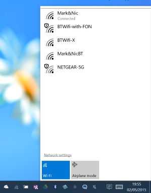 Want to connect to a wireless network? Hit the network icon in the notification area and you'll be presented with a vertical list of available connections (vertical is a word -- or a notion -- that crops up again and again in Windows 10). What’s the problem with a vertical list? Well, there's nothing inherently wrong, but the way things have been implemented here is terrible. In order to click the network icon, you've already had to move your mouse to the bottom of the screen -- to select an item from the list you then need to move right back up the screen. Not a major hardship, you might say, but it's remarkably inefficient.
The same problem arises with notifications. Move your mouse down to the bottom of the screen and click the notification button and you're presented with a popup that occupies the full height of your screen. Once again, notifications are listed vertically and you can see at a glance anything that needs your attention. But should you need to interact with any of the entries in the list, you'll need to travel back up to the top of the screen -- why not start to populate the list from the bottom up rather than the top down?
This is an excellent example of something that might make sense on a touchscreen device, but is less meaningful on systems operated with traditional peripherals.
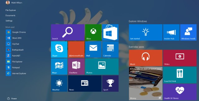
While we're looking at the notifications, just check out the size of those buttons at the bottom! It's something I've complained about before, but what gives? I'm all for accessibility, but does Microsoft think we're all blind?
The size of buttons is, frankly just silly. On a small screen, or a touchscreen device, it might make sense to have large, finger-friendly buttons that are easy to hit, but on a regular desktop computer they just look daft and take up too much space. Where's the elegance? Where's the style? Why can buttons not be reduced to small, stylish affairs that don't occupy any more space than they need to? The icons in the notification area manage to convey all of the information they were designed to using very few pixels -- why are other screen elements treated differently?
 There is still far too much of Windows Phone's influence on Windows 10 in evidence for my liking. But it's not just the fact that there's more than a hint of Windows Phone, it's that there's still such a mishmash of styles. The modern icons that are littered here and there are stark, bold, monochromatic -- and, for the most part, huge. Traditional icons, on the other hands are small, colorful, detailed, works of art. Together they look awful. Pick one or the other! The two styles together is an abomination.
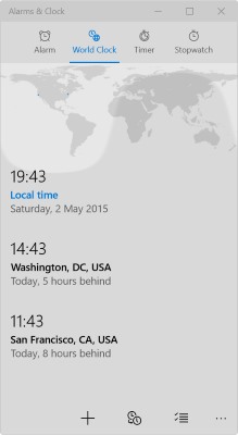
It's not just about looks, the problems with Windows 10 are also about usability. I work with people in multiple time zones so I'll frequently glance at the extra clocks on Windows to check what time it is in other parts of the world. Pre-Windows 10 it was simple -- just add a couple of extra clocks and you're done. But using the same feature in the Insider Preview once again highlights the terrible influence Windows Phone has had.
Click the system clock and yet another vertical pane flips into view -- quite what Microsoft has against spreading sideways is anyone's guess. Ah... there's the Additional Clocks option. Click it and... what on earth is that?! That's a screenshot from Windows Phone, surely? That's not a feature of Windows 10 -- no one would design a window that looks so much like a mobile app.
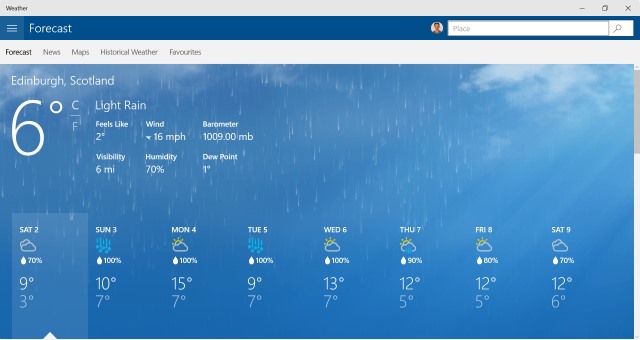
As well as looking as though someone has slapped a Lumia handset to your screen, the Alarms & Clocks also demonstrates how space-hungry Microsoft's designs have become. Yep... I'm talking modern apps. These are not new to Windows 10, of course, but their design has certainly not improved. Look to Weather, Calendar, Project Spartan/Edge and the like. Everything is just gigantic! Why not shrink the fonts, put screen elements on a diet and you can fit more information into the same amount of space? Why should I have to scroll around or click through to different sections just because everything is so huge that there's no enough room to show what I want to see?
You see, the problems with Windows 10 are not just about aesthetics, they're about usability. More scrolling and clicking to get around, more mouse travel, these all add up to make simple, every day tasks take longer than they need to. My life has been made harder rather than easier. 'Move with the times, you dinosaur!' I hear you cry, but my complaints are quite valid. I'm having to do more work to achieve the same results. You call that progress?
Windows Phone is an abomination. It has been for... well, forever, really. Let's not ruin Windows 10 by letting this cancer creep onto the desktop as well.