Google Maps gets a facelift that makes it easier to read and areas of interest easier to find
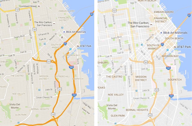
You've probably noticed that it can be hard to make out details on Google Maps. You're not alone; Google has noticed too, and the company has just launched a redesigned version of the essential travel tool.
The changes apply to the desktop, iOS and Android versions of Google Maps and the most immediately apparent difference is the new color palette -- much subtler and easier on the eyes. But Google has also cleaned things up to improve visibility, and added new 'areas of interest'.
Google said that improving the legibility of Maps "is a balancing act" and explains that it opted to remove "elements that aren’t absolutely required (like road outlines)". There have also been changes to fonts to prevent text from disappearing into the background.
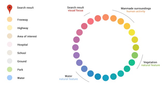
The key new feature of the redesign is highlighting areas of interest, and Google has come up with a special palette to indicate different things:
Introducing the changes, Google says:
The cleaner canvas also lets us show local information in entirely new ways. As you explore the new map, you'll notice areas shaded in orange representing 'areas of interest' -- places where there's a lot of activities and things to do. To find an 'area of interest' just open Google Maps and look around you. When you've found an orange-shaded area, zoom in to see more details about each venue and tap one for more info. Whether you're looking for a hotel in a hot spot or just trying to determine which way to go after exiting the subway in a new place, 'areas of interest' will help you find what you're looking for with just a couple swipes and a zoom.
Check out the video from Google that shows how the 'areas of interest' feature works: