Facebook rolls out Messenger interface for web inbox
Facebook has started to roll out the Messenger.com interface as a replacement for the longstanding message inbox on the web. The latest design should feel much more familiar to folks who use the chat service on their smartphones, as it closely resembles the Android and iOS apps.
There is no official announcement yet, but you should start seeing the new interface soon on your account. It debuted nearly two years ago as a standalone website and alternative to the message inbox for folks who do not want to visit Facebook (or wish to create an account with the social network, for that matter).
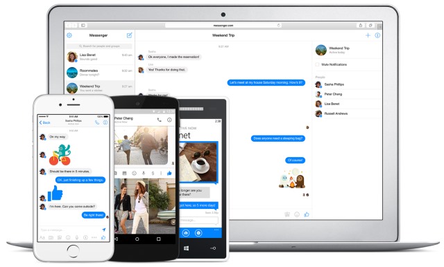
The new interface has three tabs, showing the contacts list on the left, the conversation in the middle, and, on the right, details about the contact (or contacts) you are chatting with as well as controls for the UI and other options that you might want or need. Comparing the new design on my account with Messenger.com I notice no differences between the two.
The new interface employs a responsive design, so if you have a bigger monitor like me you will be able to see all three tabs at the same time. On a smaller screen or when shrinking the browser window, it will adapt the content it displays accordingly. All the usual features should still be there, but they are now placed similarly to Facebook Messenger on Android and iOS.
Facebook's David Marcus explained the company's decision in a post that is quoted in full below.
There have been a few comments here about our recent migration from the legacy "Messages" interface on facebook.com to Messenger.com. So I thought I should share what our thinking behind this move was.
First and foremost: all of the one billion+ people using Messenger use it primarily on mobile, and occasionally on desktop. One of their main request has always been feature-parity on desktop. That means that you can now video chat from desktop, send stickers, GIFs, and way more. We basically want to satisfy the ask of harmonizing the user experience and the capabilities of Messenger across all platforms.
Second: I do understand that some of you are not using either the Messenger app, or Messenger.com. Maybe you don't have a smartphone, maybe you just want to use Facebook products exclusively on your computer, and we do respect that. I also empathize with how you must feel, discovering the messaging interface you got used to over the years suddenly replaced with something that looks and feels more mobile.
So... What are we going to do about this?
I want to split the feedback into two categories: feedback about the look and feel, and feedback about a specific functionality you lost, or that got worse because of this change. I'll focus mainly on the second one as the 1st one is very subjective, and we also know that it takes time to adjust to new interfaces.
On that point about features that you feel need work, I noted several ones:
--- The ability to write longer messages without your paragraphs being truncated in the composer;
--- Improvements on how search works;
--- Filtering messages by "unread";
--- Improvements on photo sharing and consumption.My commitment to all of you is that we will look into all of the above, and continue listening and acting on any constructive feedback you send our way.