Microsoft waxes lyrical about Windows 11's sleek new context menu and share dialog
While there are a large number of changes and additions in Windows 11, it is the visual revamp that is what most people will notice first. But Microsoft's redesign of the operating system is about much more than just looks, as the company reveals in an exploration of the updated context menu and share dialog.
Right-click on a file or folder in Windows 11, and you will immediately be struck by the new context menu that appears. In a post on the Windows Developer Blog, Microsoft explains the thinking behind the restyling in terms of aesthetics, user-friendliness and modernization.
See also:
- Microsoft is shipping Windows 11 in dark mode by default
- Want the Windows 10 Start menu in Windows 11? Tough... Microsoft has removed it
- Microsoft shares some of the design ideas behind Windows 11
You can't help but have observed that over the years, Windows' context menu has grown and expanded out of control.
This is something that has not gone unnoticed by Microsoft, and the company has decided to do something about it.
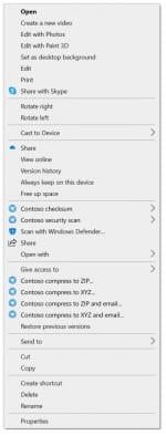
To the left, you can see an example of just how unwieldy the context menu has become, and even if yours doesn't look quite this bad, it's easy to see why something had to be done!
Microsoft identified a number of issues with how the context menu was implemented and how it operates. Problems the company noted include the fact that frequently used items are often spaced far apart, and the menu is also littered with options that are used very rarely.
It can also be difficult to identify which app is associated with individual third-party entries, and there can be a serious performance and stability hit when there are a large number of extra entries added. Microsoft also notes that:
Commands added by apps have no common organizational schema and can interrupt sections of inbox commands.
So what's the solution? If you have not had a chance to play with or look at Windows 11, you may not have seen the redesigned context menu. This is what it now looks like:
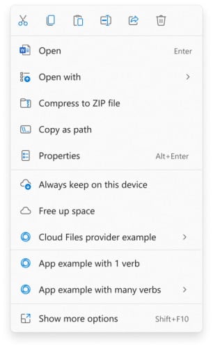
It would be hard to suggest that it is anything other than a massive improvement, and Microsoft uses the blog post to explain the specific ways in which it addresses the problems of the past:
- Common commands are placed right next to where the menu is invoked.
- "Open" and "Open with" are grouped together.
- Apps extend the menu with IExplorerCommand + app identity. Unpackaged Win32 apps can use Sparse Manifests. IExplorerCommand support extends back to Windows 7.
- App extensions are grouped together below Shell verbs.
- Cloud Files provider apps are placed next to the Shell commands to hydrate or dehydrate the file.
- Apps with more than 1 verb are grouped into a flyout with app attribution.
- "Show more options" loads the Windows 10 context menu as-is for access to low-use Shell verbs and apps still working on porting over. No commands have been removed entirely.
- Shift-F10 or the keyboard menu key will also load the Windows 10 context menu.
The share dialog has undergone a similar restyling, and you can find out more about this in Microsoft's blog post.
Image credit: sdx15 / Shutterstock