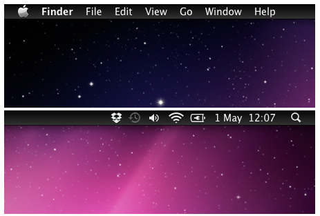
Get a dark menu bar that matches OS X's cosmic desktop

Unlike Windows computers, Macs tend to have something of a uniform look to them. Sure, you can move the dock around the screen and choose a new background image, but there just isn’t the same tweaking and customization community that exists for Windows. MenuBarFilter is a free tool that brings basic, if much welcome, customization of the menu bar to OSX.
This is a tiny utility that you need simply unzip, copy to your Applications folder and then add to your list of login Items. Once this has been done, the menu bar will no longer be silvery grey with black text, but the exact opposite. The light text on a dark background look is not only somewhat classier than the default colors, it is also in keeping with how things are in iOS.
It is not just changing the appearance of OSX that makes the tool appealing, the new look afforded by the dark version of the bar is easier on the eye a serves as less of a distraction. It is an item of screen furniture that you have become used to over the years -- you know where it is and what it’s for, so there’s no need for it to draw attention to itself with a light color scheme.
Installing MenuBarFilter gives you a look that is more in keeping with iOS and also prevents the menu bar from being an unnecessary distraction. With the darker colors in use, it can blend in better with your monitor, but whatever your reasons for install the tool, you get a great new look for your desktop that oozes style.
You can find out more and download the free utility by paying a visit to the MenuBarFilter review page.
