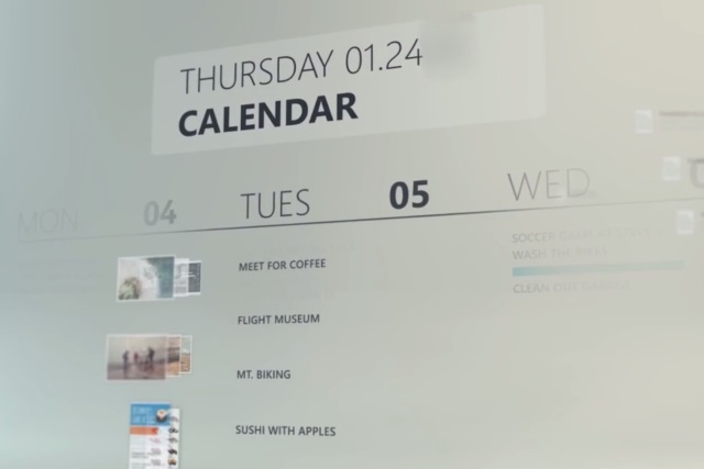
Microsoft brings Fluent Design System to Windows 10 -- but WTF is it?

When Windows 10 arrived on the scene, much was made of the Metro (or Modern) look of the apps. This was Microsoft's design language of the time and now it's time to throw out the old and usher in the new. We've heard a bit about Project NEON in recent months, and this has now evolved in to the Fluent Design System.
This is the new design language for Windows, and it will be making an appearance in Windows 10 Fall Creators Update -- although you can already see glimpses of it in the Redstone 3 builds if you are a Windows Insider. Microsoft describes it as "an eloquent design system for a complex world," and introduces five main building blocks: Light, Depth, Motion, Material and Scale. But just what is it going to mean for the future of Windows 10?
In reality, Fluent Design System is little more than a new lick of paint for software. Yes, there are some fancy visual effects, some lovely transitions and animations to ooh and ahh over, but this is all about aesthetics rather than function. Of course, there is some relationship between design and function, but assertions that this is Microsoft's "opportunity to look at a complex world, and make it more eloquent" (so says Tim Allen) or that it will bring an "intangible quality you feel as things work together" (Shelley Bjornstad) are likely to be met with snorts of derision from the average Windows 10 user. Likely reactions include "oh, that’s fancy", "that looks a bit different", "cool", and "WTF has Microsoft done?"
Microsoft is touting this as a design evolution, a design language for a multi-sensory, immersive experience, and it's clearly driven to a large degree by the need to create a new experience for HoloLens and other augmented reality scenarios. Augmented, or mixed, reality experiences are -- by their very nature -- three dimensional in nature, and Fluent Design System is Microsoft's attempt to translate this idea onto the 2D screen of the average Windows 10 user, as well as the touchy-feely world of Microsoft apps on iOS and Android.
But what will Fluent Design System mean in practice? The Light element means that highlighting and focus-drawing comes courtesy of artificial light. Depth means working in a pseudo-3D environment, complete with all-direction parallax scrolling. Motion means that off-screen elements slide gracefully into view, just about everything is animated as stasis is stamped into the ground. The Material component is about how elements interact with each other as much as anything else; it includes transparency, highlighting, shading, and so on. Scale seems to be where things fall down slightly and it only really exists in the immersive world of HoloLens at the moment. Microsoft even says: "We’re scaling our design system from 0D to 3D, inviting innovation across new forms. And we’re looking to you to help us imagine this new world."
So is FDS worth getting excited about? About as much as any new theme or redesign really. If you yearn for the days of Glass and Aero, this is a modern twist. Microsoft may try to make it seem like more, but as you can see from the video, it's not really anything earth-shattering.
You can find out a little more on the Fluent Design System website.
