A Google Chrome user's opinion of Safari 4 Beta
After writing for Betanews for a couple of years, there's something you may not know about me. If there is one company that I approach with favoritism (but never fanboyism!), it's Google. Yes, Google's omnipresence is enough to make you want to don a tin foil hat, but it's hard to argue with a company that gives everyone such powerful research tools at no cost.
Take Chrome, for example. I'm going to keep this anodyne by saying that there is no perfect browser, and I personally keep five different ones installed for testing purposes. However, Chrome managed to deliver in its first release what other companies took years to deliver, while giving it the classic Google design ethic. Where customizability is often sacrificed for elegance, Chrome strikes a balance, and offers a dynamic browser still that lacks clutter. Therefore, I use it quite a bit.
That said, Safari is another browser that I use a lot, but not due to any real effort on my part. Quite the opposite, actually. My relationship with my Mac is the following: I make no unusual demands of it and use it for what it tells me it can do. I'm really quite lazy about it. Yes, I run resource intensive applications like Logic Studio and Corel Painter on it, but that's sanctioned Mac stuff that works right out of the box, and I digress. I use Safari regularly but have no particular affinity for it, so in testing it, it's both a pleasure and an annoyance to see the direction it's heading.

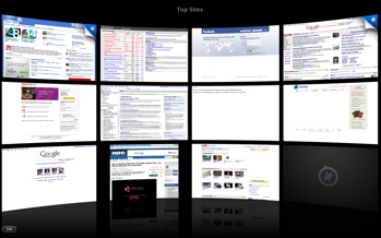
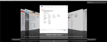
The Safari 4 beta has brought the "about:blank" default home screen from Chrome which shows your most frequently viewed sites and given it the iTunes treatment. It's just as useful, and just a bit prettier than Chrome and its Speed Dial counterparts. A search can be performed within the top viewed sites, which yields a Cover Flow of screenshots with the term you searched. The retrieval of these screenshots is wastefully slow.

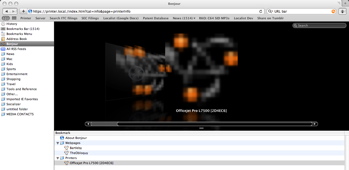
A long overdue and welcome addition to Safari is the revamped bookmark screen. This also has been given the Cover Flow interface, with fantastic results. The first time I ran it, it took an extremely long time to fetch screenshots of each site to flesh out the window. My Bonjour devices -- a file server, printer, and Chumby -- never really came together in that layout though, and are represented by blown up 3k sidebar icons that are just downright unfortunate.

The browser itself has taken a design cue from Chrome and moved the "Stop/Refresh" button to the inside of the address bar, and moved browser tabs to the top of the window instead of beneath the address bar.
After updating Safari to the newest beta, something silly started happening. I started typing search queries in the address bar. This "auto pilot" behavior is one I picked up while using Chrome that only happens when I'm using that browser. Maybe I've just had it on the brain since I've been using it, or maybe my subconscious mind has recognized the similarities and it reacting. I have no doubt that it's just the former, but it's nonetheless frustrating to repeatedly make that mistake.
Here's the bottom line: These new headlining features in Safari 4 are useful, the same as they are in Chrome. However, the aesthetic improvements Apple has added appreciably slow down an experience where I have come to expect a certain degree of performance. Call me crazy, but I'll take stripped down and quick over gorgeous and lagging any day of the week.
