The new Skype for Desktop 8 is here (whether you like it or not)

Keeping in touch with other users is essential for your business. We use Skype to keep in touch with contacts all over the world, from freelancers writers, through to key contacts.
With this in mind, all we want is a relatively simple tool that enables us to perform our business without distractions.
Sadly, Microsoft has made major changes to the Skype iOS and Android apps and those changes haven’t gone down well. Microsoft previewed the same changes in the desktop edition, a few months ago, and we quickly removed the preview.
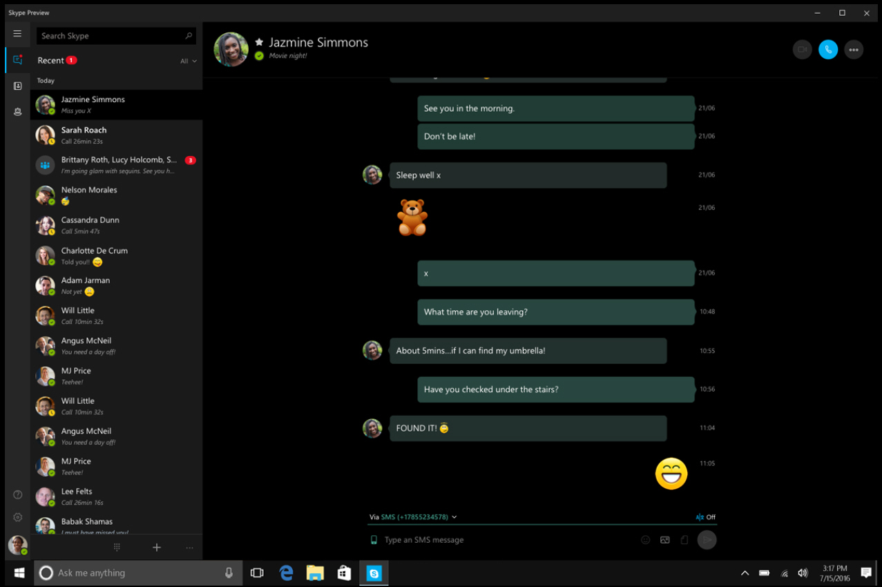
Now Microsoft has released the preview features as a standalone Skype for Desktop 8.9, with the majority of the changes in place, including the new color scheme and daft noises when people post new messages. In an odd u-turn, the new Windows 10 version of Skype looks like the previous 'classic' version and is a pleasure to use.
So, what’s new in Skype for Desktop 8.9? Customizable themes, but limited to a dark (all-black) and light mode. Skype is now cloud-based, meaning that all your data is quickly synchronized, plus it’s now possible to share a file up to 300MB in size and, if you receive a lot of messages whilst you’re away from your desk, the new notification panel will offer a quick overview of these conversations.
The biggest change is the group calling, which now enables you to react to what you see or hear from the group conversation, using an emoji and other non-business icons. To grab another person’s attention, simply @mention them by their username and they’ll be notified. You can also share your mood with the rest of the group.
There are some good things, but some less good things from this desktop update. We’re hoping some of the colors (such as the chat bubbles) settle down or can be altered in future editions. Some of the UI effects, particularly in the Mac version, are very non-standard, too.
