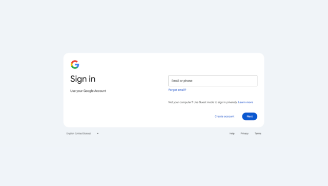
New interface for Google account sign in page revealed at last

If you use any of Google’s multitude of services, you will almost certainly have noticed notifications in recent weeks about a new look that is "coming soon". This may well have piqued your interested, and now Google has revealed what all the fuss is about.
A new sign in page (and sign up page) is now rolling out to not only Google Workspace, but also personal Google accounts -- so you will see it when signing into your Gmail account, for instance. What you can expect is, as per usual, a cleaner, "more modern" look.
See also:
- Google thinks ChromeOS Flex could replace Windows 10 or Windows 11 on your PC, or even macOS on your Mac
- Microsoft pushes KB5034848 update so more people can try Windows 11 Moment 5
- Windows 11 users complain of taskbar, Start menu, and performance issues with KB5034765 update
Google announced the start of the rollout in a blog post. Here the company not only shared an image of the new look, but also had a little to say about it.
There's not really much to say as the change is hardly huge, but it's a welcome refresh nonetheless:
We're updating the look and feel of our sign-up and sign-in pages with a more modern look, which is in-line with the Material Design across our other products. You'll see the updated interface across web and mobile devices. Note that this is strictly a change in visual appearance, there are no functionality impacts or changes.
The rollout is a quick one, starting now and due to be completed by March 4.
