
Google makes its new gradient G logo company-wide
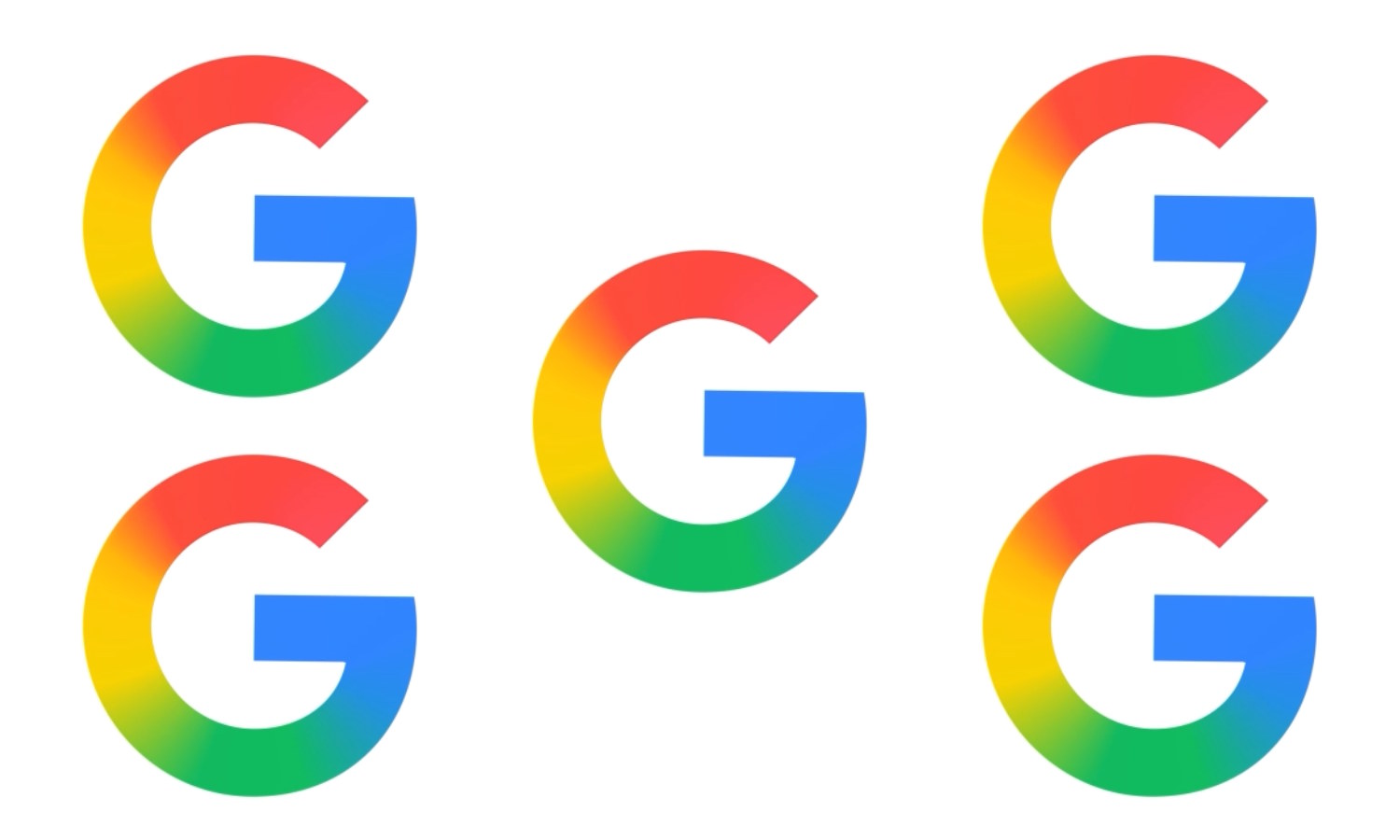
It is a little while since Google first started to use an updated version of its colorful G logo. The design revamp saw the company moving away from the four colored blocks of color towards something with more flow.
The graduated look of the G was introduced with little in the way of fanfare, and quite what Google had planned was not clear. Now, having seemingly tested the waters by trying out the new look in a limited number of places, the company is ready to use it more extensively.
Paint the whole world with a rainbow: Google rolls out new icon design
The Google logo is iconic -- as, indeed, are its icons. Every so often, though, there is an update, a refresh… normally to great fanfare.
But this time around things are a little different. Google has very quietly rolled out a new icon for its search app and has made no fuss about it at all. All of the familiar design aspects are present, but now there is a rainbow gradient.