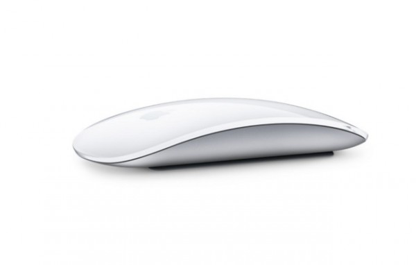
Apple's Magic Mouse 2 is a design abomination

Apple is a company synonymous with not just design, but thoughtful design. At least that's usually the case. With the Magic Mouse 2, however, the company has got something so unbelievably wrong that it almost defies belief.
Forget the absurdity of the name for a moment and just consider what the Magic Mouse 2 is. It's a wireless mouse. Like other wireless mice, it needs power, and this is provided by a rechargeable battery; plug in a Lightning cable and juice up that peripheral. Here's where Apple gets it wrong. The charging port is on the underside of the mouse. On the bottom. So you can't use the Magic Mouse 2 while it charges up.
It's hard to understand quite how this came to be. With the requirement to connect a charging cable to the base of the mouse, it is rendered completely useless when it runs out of power. Other rechargeable mice get around this 'problem' by placing the charging port on the front of the mouse. This allows for the mouse to be used much like a corded mouse as it charges.
But not Apple, oh no.
If your Magic Mouse 2 dies when you're in the middle of doing something, you'll just have to stop what you are doing and wait for it to charge up again. You could connect another mouse, but why should you have to?
Maybe you're having trouble visualizing something as absurdly stupid as a mouse with a base-mounted charging port. Here's what it looks like:
https://twitter.com/anildash/status/654445004983824385
It really is difficult to gets one's head around the design conversations that led to the creation of the Magic Mouse 2. It's utterly insane.
