Linux Mint 15 -- The best Linux distro gets better
 Linux users are a strange bunch. As a distro gets popular, it tends to lose credibility with the Linux elitists. It is much like an underground rock band. As the band gains mainstream success, the original fans view the band as "sell-outs". For instance, Ubuntu, the most popular Linux distro, is viewed negatively by many as a beginner distro (Linux users only feel this way because of its success -- Ubuntu is a wonderful OS). Linux Mint however, is the exception to the rule -- it is revered by newbies and elite users alike. This is despite its long-held top spot on www.distrowatch.com and the fact that it is based on Ubuntu.
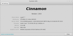
On May 29, 2013, Linux Mint 15, codenamed "Olivia" was released. This is the newest version of Mint and is based on Ubuntu 13.04. While Linux Mint is built on Ubuntu, it removes what many users hate about that distro -- the Unity desktop environment and integrated Amazon.com search.
 Instead of Unity, Linux Mint generally offers two desktop environments -- Cinnamon and Mate (other environments such as KDE are usually made available later). Both of these are forks of Gnome. Mate is a fork of Gnome 2 whereas Cinnamon is a fork of Gnome 3. To clarify, a "fork" is when someone alters an existing program’s source code. A program is typically forked when someone is dissatisfied with the program in its existing state. For the purpose of this article and test, I am using Cinnamon as it is more "modern" than Mate.
Cinnamon still offers a classic desktop interface -- much like Windows 95 through Windows 7. The user clicks on a button in bottom left of the screen and is presented with a listing of the installed software. The programs are opened in windows and can be maximized or minimized.
While many may find this to be boring, it adds to the allure of Linux Mint. This classic styled desktop interface is what makes Linux Mint so accessible -- Windows users can jump right in.
Linux Mint comes pre-installed with some wonderful programs including:
- Firefox -- for web surfing
- GIMP -- for photo editing
- Banshee -- for music
- Pidgin -- for instant messaging
- xChat -- for IRC
- Libreoffice -- for office work
All of these are great choices. However, users can easily add additional software using the software manager or by installing .deb files from the web. I personally installed Google Chrome from the web and Audacious from the software manager. While the Linux Mint software manager is not as full-featured as Ubuntu’s, it is far less bloated and offers better performance. I prefer it to Ubuntu’s by far.
What’s New in Olivia?
One of the first new things I discovered was the new login screen with Mint’s MDM. It was very aesthetically pleasing with pictures of clouds -- the little things do matter. This polished login screen tells the user that this is a cared-for distro. According to Mint, this screen can be customized, including animations. However, I did not see a reason to do this on day one of using the OS.
I also found a new feature called "Desklets". These are just desktop widgets. I was excited for this new feature until I tried it. The first desklet that I added was a clock. It was a very basic widget that displayed a clock on the desktop. Unfortunately, it displayed the time in 24-hour format (we Americans call it "Army Time") and there was no way to change it to AM/PM. It ignored the fact that I changed the system time to AM/PM -- bummer. The second desklet I tried was an XKCD comic widget. I love the comic but I hate the desklet -- it just took up space. Also, I found that each comic was being stored as a file in my Pictures folder, something I did not appreciate. I quickly removed both of these desklets. While the desklet feature is nice to have, I am disappointed with the quality of the launch day widgets. I’m sure they will get better but it was a poor first experience.
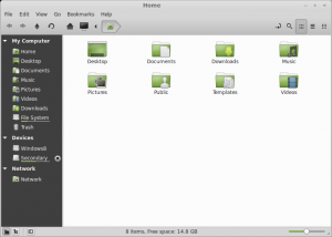
 Also new in Mint is a new version of the Nemo file manager. To those that don’t know, Nemo is a forked version of Gnome’s "Files" program. I normally consider myself a purist when it comes to Gnome programs. However, Nemo greatly improves upon the original -- it is now vastly superior to Files. The UI is far better including a new bar that sits under each drive and tells you how much space is left. Again, it’s the little things that matter sometimes.
Another new feature is a lock screen away message. This is a neat addition that lets you add an away message to your lock screen. I don’t see the point of this really. I guess if someone walks up to your workstation, they can read your screen to see where you are. However, most businesses frown at users getting up from their seats to go to a workstation (email or messaging should be utilized). Even if someone did walk up to your workstation, chances are, your monitor will be asleep/off. I found a bug with this feature as well. I set an away message when locking my computer. However, it did not clear the message when I unlocked it. So, an hour later when I walked away without manually locking, the system auto-locked. My previous lock message was now displaying. I could see a user putting "Out to Lunch" and then having that display all day long, whenever they leave their desk. Hopefully their boss doesn't get mad!
Conclusion
Do I really think Mint 15 Olivia is the best Linux distro today? Absolutely and unequivocally. It just works and it works well. That is the most important aspect of any operating system -- stability and dependability. Mint builds on the stability and foundation of Ubuntu and takes it a step further by polishing and perfecting the user interface and overall experience. The secret to Mint’s success is that it listens to and focuses on its users. If only all distros did the same...
Photo credit: Volosina/Shutterstock
