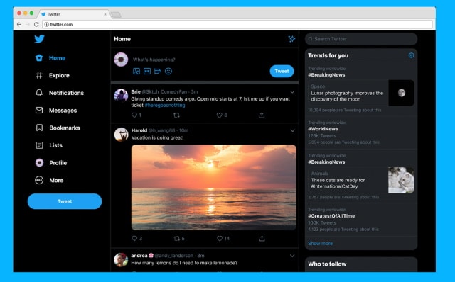
Twitter redesign rolls out on the web

Twitter is rolling out a faster, redesigned version of its website, bringing not only a new look to the desktop, but also a range of new features.
It's now possible to bookmark tweets -- something users have been asking for for a very long time -- there is a darker dark mode, and the Explore feature from Twitter's mobile apps makes its way to the web. There's certainly a lot to like, but the fact that the new look is not optional is likely to grate with some users.
The redesign has been in the pipeline for some time now, with testing having been underway for around a year. During the testing phase it was possible to opt to stick with the old style, but this is no longer an option.
Twitter alerted users to the change through -- obviously -- a tweet:
https://twitter.com/Twitter/status/1150812293124546561
You'll know when the redesign hits your account because pretty much everything will be in a new location. Time to start learning how to use Twitter again! Direct messages now have a home of their own, and navigation is found to the left of the screen, while trending content is to the right.
These are some of the visible changes to the frontend. There have also been a number of backend changes that not only help to make Twitter faster and more personal, but also mean that in future it will be possible to add new features. As the much yearned-for "edit" button is yet to make an appearance, hopes will be high that once Twitter decides how to implement it, it can be pushed out quickly.
Twitter says that the rollout of the redesign will take a few days, so you may not see it right away.
