Google has moved downloads to the toolbar in Chrome -- but you can resist change if you want

As users of Google's web browser will be aware, Chrome has long featured a download bar at the bottom of the app window. While keeping download progress tucked out of the way made sense in some ways, it represented somewhat of a frustrating design inconsistency in moving download-related information away from the main browser controls in the toolbar.
This is something that Google had addressed in the latest update to Chrome, ditching the downloads bar with a new button in the main toolbar. While this is likely to be welcomed by most users, there will be some who prefer things how they used to be. Let's take a look at the new download button and also show you how to revert to the old approach if this is your preference.
See also:
- Leaked: Microsoft's secret StagingTool utility for unlocking hidden features of Windows 11
- Microsoft releases PowerToys v0.72.0 with new plugins and a massively reduced footprint
- A recent Windows 11 update is breaking the Start menu -- but Microsoft is shifting the blame
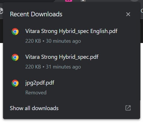
With the Chrome update, you should see a new button in the toolbar. Housed to the right of the address bar, the button features a downward-pointing arrow and when you click it, you can see a list of your recent downloads in a pop-up.
The pop-up serves as more than just a list of your most recent downloads, though. There is a Show all downloads link that takes you to Chrome's Download page where you'll find a full download history. Hover your mouse over individual entries in the pop-up, and you can use the two buttons that appear to either open the downloaded file, or to open its containing folder. When downloading a file, the button changes to show how the transfer is progressing.

The change brings Chrome in line with other browsers, such as Firefox, that have used a similar approach for some time. The previous method of displaying download-related information at the bottom of the screen was not only slightly odd in terms of positioning and made for an awkward UX, it also meant that whenever a download was active or complete, a proportion of the browser windows was occupied, reducing how much of a page could be seen at once.
But if you like the way things used to be, there is a way to revert to the old behavior. You just need to pay a visit to chrome://flags/#download-bubble, set the flag to Disabled and restart Chrome.
Image credit: Ilya Sergeevych / Shutterstock

Pingback: 🎉 Chrome updates, using ChatGPT, dissecting privacy policies, and more – Of bits and bytes for August 14, 2023 – #Eduk8me