Windows Mobile 6.5 drops its 'honeycomb'
At MIX 09 in Las Vegas, Microsoft showed off its latest version of Windows Mobile 6.5, which has experienced a number of UI design tweaks.
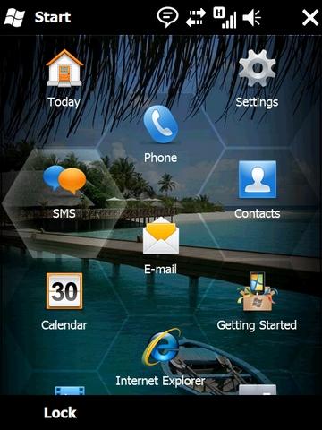
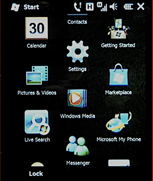
The most noticeable change since the OS debuted last month is the elimination of the on-screen honeycomb on the home screen. While the layout remains essentially the same, the icons have grown in size, and the hex-grid pattern has been removed. Microsoft Product Manager Loke Uei Tan said that users who were testing the UI in real life found that it wasn't quite "finger friendly," so it has been tweaked with that in mind.

Before

After
The lock screen was also changed to show alerts and notifications, and flick scrolling has been tweaked to stop at page breaks instead of spinning the traditional "roulette wheel" all the way to the end of the list.
Also, Microsoft disclosed a precious few more details about the forthcoming Windows Marketplace for Mobile. Every Mobile 6.5 device will offer a Marketplace app out of the box, and items for sale will include not only apps coded in .NET and C/C++, but also widgets which will run from the home screen. Microsoft told Betanews earlier this week that these widgets are written both in JavaScript and HTML and are hosted at run time by Internet Explorer Mobile.
Purchases are done directly to the user's credit card, rather than through the carrier, or through a third party like PayPal, and updates to those purchases are done automatically.
The Windows Mobile family already has more than 20,000 apps made by thousands of independent software vendors (ISVs), and Microsoft sees the Marketplace as an opportunity to greatly improve developers' incentive to create outstanding applications for the platform.
