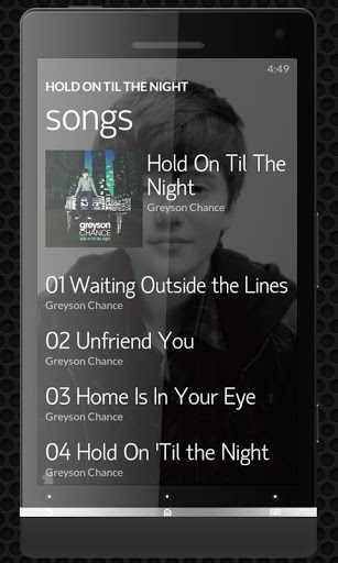
Whoa, noozy studio 3 brings Zune-like UI to your Android music
 Music players are not exactly thin on the ground on the Android platform, and the battleground on which users are gained and lost is the user interface; noozy studio is a music app, which features a somewhat minimalistic look and feel, and bears more than something of a resemblance to Microsoft Zune. The interface is largely text driven, which helps to give the app a clean, modern look.
This is an app that can be used to listen to both locally stored and online content, and enables users to discover new music by browsing through what others have been listening to. Listening to music stored on your Android device is much as you would expect, with album art being displayed at the same time as playback controls. If you’re a music fan, the sound quality of what you listen to is going to be important – there are a number of processor effects included with the app that can be used to improve sound in various ways.
In addition to music and video, noozy studio 3 can also be used to listen to podcasts and make new subscriptions. It is the online aspects of the app that make it shine -- in addition to its good looks -- and the option to listen to any of thousands of online radio stations is a nice inclusion. If you stumble across a station you like, you can add it to a list of favorites for easier access. In radio mode, it could be argued that playback controls are a little awkward to get to, but this is down to personal taste really.
The app provides you with the ability to discover new music by browsing through the Charts section. Here you can find out what other noozy studio users have been playing and listen to previews of tracks. If you find something you particularly like, a purchase option is available.
You can find out more and download a free copy of the app by paying a visit to the noozy studio review page.
