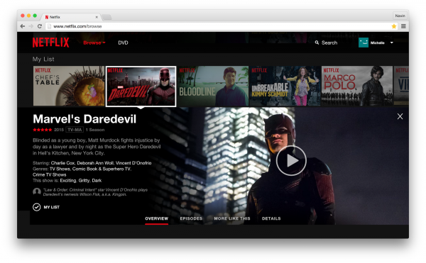
Netflix overhauls the web interface, becomes more like an app

Netflix has been busy with content, although the video service has somewhat been neglecting the website it maintains. But that's all changing now as the company unveils a complete revamping which it hopes customers will find much more useful.
This update promises a better user experience that "has been built from the ground up to make it faster and easier to discover something".
What this means, aside from a better visual experience, is that content will now appear inline, as opposed to being a series of linked pages. That should make content easy to figure out. Just hover your mouse over a title to get information and images, while clicking it will provide additional information and a list of episodes, still inline.
Netflix also promises more efficient scrolling with the fast action of a mouse-click to move a column. This will also work with a trackpad or a touch screen.
This is a gradual roll-out, but Netflix plans for it to be completed relatively quickly -- within two weeks, the service claims. One caveat is also offered -- "A small number of members on older versions of popular browsers will be prompted to upgrade their browser before they can access the new site". Happy viewing.
