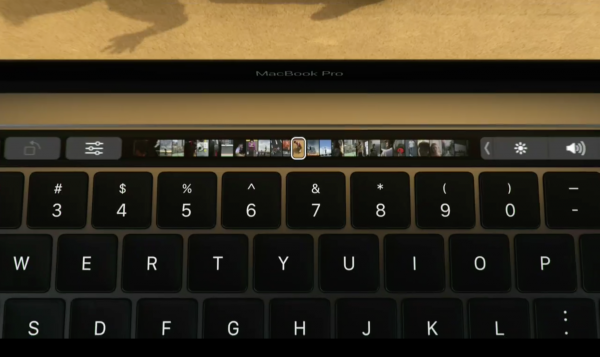
Apple wants to limit how the new MacBook Pro (2016) Touch Bar can be used

When Apple unveiled the latest MacBook Pro, it was the Touch Bar that stole the show. But if you were expecting this touchscreen addition to the keyboard to become an all-singing, all-dancing fun parade, you may be disappointed.
Apple -- loving, as it does, to remain firmly in control of everything -- has issued developers strict guidelines that restrict how the Touch Bar can (or should...) be used.
The company is very keen for the Touch Bar to be seen as an extension of, or addition to, the keyboard, and not the screen. As such, Apple is keen to avoid the Touch Bar being anything other than useful -- and certainly avoiding the risk of it becoming a distraction. TechCrunch shares details of some of the guidelines that have been given to developers:
- Use the Touch Bar as an extension of the keyboard and trackpad, not as a display.
- The Touch Bar shouldn't display alerts, messages, scrolling content, static content, or anything else that commands the user's attention or distracts from their work on the main screen.
- Avoid animation. The Touch Bar is considered an extension of the keyboard, and people don’t expect animation in their keyboard.
- Use color tastefully and minimally. In general, the Touch Bar should be similar in appearance to the physical keyboard.
- In general, the Touch Bar shouldn't include controls for tasks such as find, select all, deselect, copy, cut, paste, undo, redo, new, save, close, print, and quit.
It remains to be seen whether developers choose to abide by these guidelines, or what sort of penalties -- if any -- might exist for those who decide not to. But it is safe to assume that there will be a burgeoning market of third party tools that go against everything Apple has set out.
