Microsoft's redesigned Windows 10 Start menu is a big improvement

Windows 10 has been around for five years now, and although Microsoft has introduced a number of big changes over the years, the Start menu doesn't look hugely different from how it was when the OS debuted back in 2015.
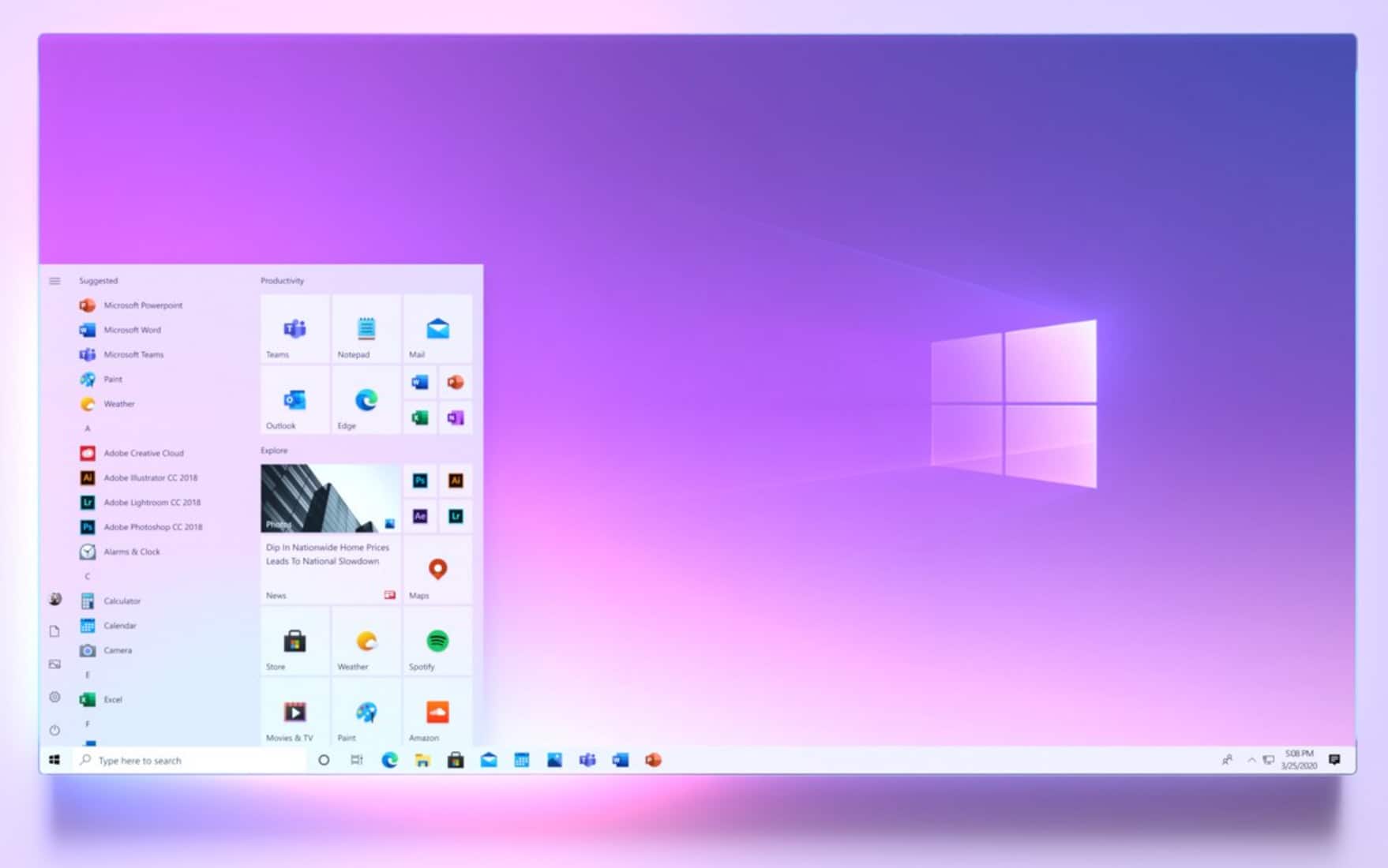
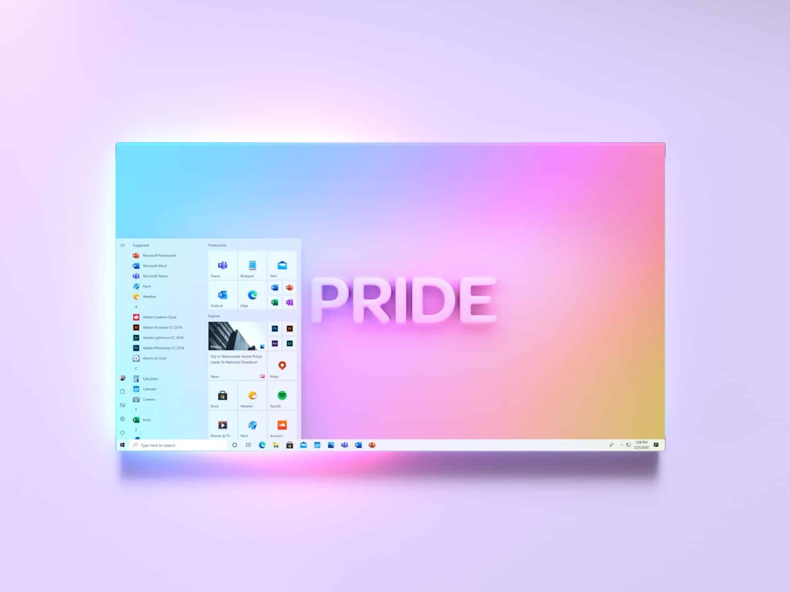
That’s all about to change though. Microsoft is planning to overhaul the menu, and it’s released a number of new images to give us a clearer idea of how it will look.
SEE ALSO:
- Windows 7 returns with the stunning 2020 Edition
- Forget Windows 10, Windows 20 is the Microsoft operating system we need!
Posted to the Microsoft 365 Facebook page, the images show a much cleaner Start menu with a translucent background, and new Fluent Design icons. While Live Tiles are very much still part of the design, they integrate much better here.

Although we’ve seen various superior Start menu designs in the many Windows 10/11/20 concepts we’ve covered here previously, Microsoft's new version looks like a big improvement to me.

There’s no word on when exactly we can expect to actually get the new Start menu, but the fact that Microsoft is now freely sharing more images suggests we shouldn’t have to wait too long.
