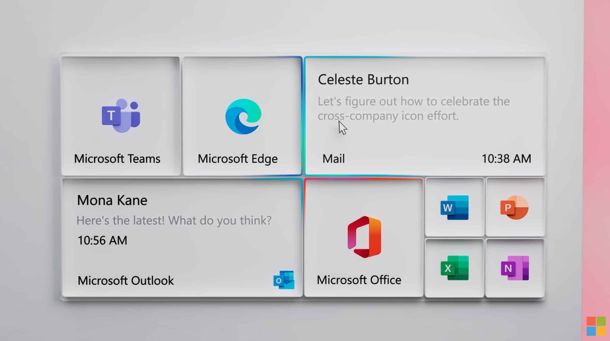
Microsoft teases a stunning new Windows 10 Start menu

Microsoft rolled out an updated Windows 10 Start menu to Windows Insiders a month ago, and that menu is now available to all -- if you follow these instructions. The tweaked design removes the solid color backplates behind the logos and adds a translucent background to tiles.
However, it could be that bigger changes are afoot. In a video showcasing Microsoft’s new icon system the search giant also reveals a stunning new-look Start menu.
SEE ALSO:
- Why you need to upgrade to Windows 10 Pro and how to do it on the cheap!
- Windows 7 returns with the stunning 2020 Edition
- Forget Windows 10, Windows 20 is the Microsoft operating system we need!
Talking about its new icon system, Microsoft says:
Our mission was to create a beautiful, moving, coherent icon system, and each discipline added its expertise to the process. The resulting One Microsoft icon design language is unique to Microsoft and reflects our brand personality.
Towards the end of the video, Microsoft shows off a new Start menu with an attractive tiled system, which you can see above. When the video cuts to a wide view we see the current menu design, which is a bit disappointing.
Whether Microsoft will actually implement this style of menu in the future remains to be seen, but it shows what’s possible, and is a huge step up from the current tiled layout.
What’s your view of this new menu design? Do you like it? Do you prefer it to the current menu, or would you rather Microsoft did away with tiles altogether? Comments below please.
