It took 4 min 34 sec to get me really excited about Windows again
Sign me up for the Windows 8 beta, Microsoft, and I'll sell my MacBook Air. Perhaps the Samsung Series 9 should be next?
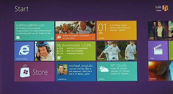
Late yesterday, Microsoft gave the first sneak peak of Windows 8. What a peak! Apple unveils Mac OS X 10.7 "Lion" in just four days, and it's antiquated before release. Microsoft has taken one of the freshest approaches to operating system user interfaces since, well, the Macintosh in 1984. The new UI is fluid and modern, using HTML5 for rendering.
Microsoft debuted the new operating system last night Eastern Daylight Time at the D9 conference in Rancho Palos Verdes, during the session for Steven Sinofsky, Windows & Windows Live divisional president. I wasn't there, but got a gander at Microsoft's 4 min 34 sec video posted later. I'm in love. Can I hug you, Windows 8?
Tracing the UI's Heritage
"A Windows 8-based PC is really a new kind of device, one that scales from touch-only small screens through to large screens, with or without a keyboard and mouse," claims Julie Larson-Green, corporate vice president of Windows Experience, in a statement released yesterday. Larson-Green is one of those polarizing Microsoft managers. You've got to love her, or loathe her. Love, is if you're into the "ribbon" user interface introduced with Office 2007. Loathe is if you pine for the old Office UI. Her team was responsible for the ribbon. Soon after Office 2007 shipped, she moved over to the Windows group.

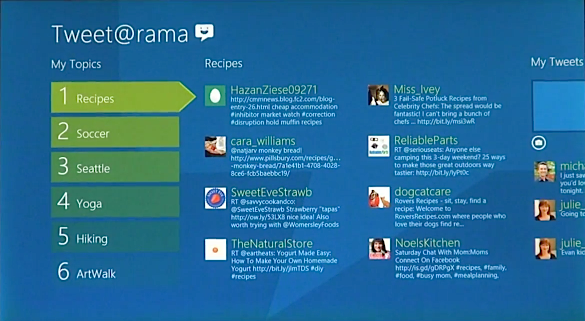
Windows 8 looks lots like the Windows Phone tile user interface, which inherited qualities from Zune. Touch is common denominator going from Zune HD to Window Phone 7 handsets to Windows 8 PCs. Tiles are the means of unifying the user experience across devices. But Windows 8's heritage goes way back to the 1990s.
"Windows 8 apps use the power of HTML5, tapping into the native capabilities of Windows using standard JavaScript and HTML to deliver new kinds of experiences," Larson Green explains about the underpinings. "These new Windows 8 apps are full-screen and touch-optimized, and they easily integrate with the capabilities of the new Windows user interface."
There's a strange sort of irony about this HTML5 stuff. It's as much a business-as-usual approach as potentially trendsetting. Microsoft has been pushing the browser as part of Windows since the late 1990s. The tactic lead to a landmark antitrust case that Microsoft lost. Coincidentally, or not, U.S. government oversight resulting from the case ended last month. Now who is Google going to complain to about the new operating system, like it did with Windows Vista and 7?

The approach of a browser-based user interface isn't new for Microsoft, nor is the software giant alone. Google courts developers to write web apps for Chrome and Chrome OS. But Microsoft has been working at this for much longer, since Internet Explorer 4 and Windows 98, in earnest, pushing the browser and its rendering engine for software development.
Task-Oriented Approach
Nor are the concepts unique. Microsoft had toyed with a more task-oriented interface for Millennium Edition. Paul Thurrott has a good primer on the task-oriented "activity centers," which never shipped. Similar concept was planned for circa 2000 Windows Neptune, which also never shipped. Windows 8's tile user interface is similarly task-oriented and incorporates many of the same tasks envisioned more than a decade ago.
But the execution is different now, and the technologies supporting it -- like touchscreens. Microsoft also has honed the basic approach and concepts on Windows Phone. I'm so damn impressed by the video. The new UI demos well.

It's about time that Microsoft made the hard decision to start over and put a fresh user interface on Windows. That couldn't have been easy for a company whose development priority has always been backward compatibility. That will be there, as Microsoft absolutely plans to support the old UI motif for older applications. Considering how slow many businesses are to move forward, Microsoft had to provide this lifeline to the past.
But ultimately, Microsoft is taking a go-forward approach. The new UI will undoubtedly play better on tablets than desktops or even laptops. Apple's iPad may be hot stuff, but big cheese analyst firms IDC and Gartner count it as a media tablet. The firms don't consider iOS to be a full operating system, unlike Windows. Tablets running Windows count as PCs.
So-o-o-o-o, I'm pretty tanked about Windows 8 after watching the above video. Are you?
