
Microsoft is giving its icons a sleek and smooth makeover
Microsoft has officially announced a subtle revamp of its Microsoft 365 icons. Taking something of a cue from Google, the redesign is subtle and sees a switch towards using gradients and flowing colors.
The update is the first for Office icons since 2018, and this latest change is a gentle revisiting and dialling up of the changes that were introduced then. This is not a rebrand or a major change, but a pleasing evolution.
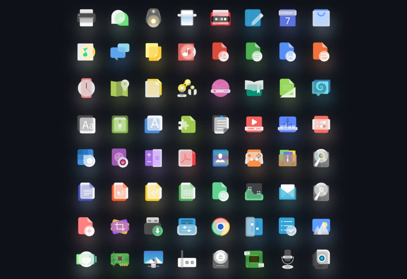
You can now give your Linux desktop a Windows 11-style 'Fluent' makeover
Windows 11 is far from perfect -- it’s still very early days for the new operating system after all -- but it sports an attractive, modern aesthetic thanks to the use of Microsoft’s Fluent Design System.
If you like the look of Windows 11, but prefer to use a Linux OS, you can now get the best of both worlds by applying a new 'Fluent' icon set.