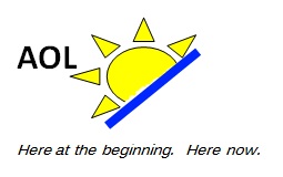
Can you come up with a better brand for AOL than 'Aol.'?
The new, much maligned "Aol." logo has upped its failworthiness. Newest buzz: A 27-year-old with no marketing expertise was the driving force behind AOL becoming Aol.; that has many people wondering what the company was thinking.
Age isn't so much concern as lack of marketing expertise. What was AOL thinking, particularly with the rebranding being so important to a company spinoff planned for early December?
I think Betanews readers could do at least as well, and probably a lot better. So I ask: What would you have done with the AOL brand? Please respond in comments. Be graphic. Be creative. Be critical, if like me you think Aol. spoken aloud sounds like "A-hole."

[Update: Betanews reader Jason Syth submitted the logo above. I'll add others as they come in from other readers.]
