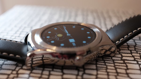
LG Watch Urbane fast, first impressions [mini-review]

Early yesterday afternoon, LG Watch Urbane arrived from Verizon. Turnaround is quick for anyone who wants one right way, rather than waiting for Google to ship (now 1-2 days rather than by May 8). I am rushing a first-impressions review, and some comparison to the Moto 360 is mandatory. If round is your taste, consider one of these two smartwatches.
Meantime, to collect my thoughts for the review and for anyone considering the Urbane, I share something sooner. Overall, I am satisfied with the initial out-of-the-box experience. Urbane is gorgeous and looks like a traditional watch. The always-on, dimmed face contributes to the effect—without bleeding dry the charge. The watch is also more functional as a timepiece, as such. I mean, shouldn't it be?
The thing is large but not heavy, which is surprisingly good considering the stainless steel shell. The strap is overly stiff, but it looks great. That the timepiece takes a standard 22mm band is a huge benefit. Swap away, watch crazies! Verizon offers the silver with black strap, which is the one I wanted. The other is gold with brown band.
So there is no confusion: LG makes two Urbane variants. The other comes with LTE radio; the timepiece isn't dependent on a smartphone. However, that device doesn't run Android Wear—and that's good segue to something surprising. The operating system isn't as universal as expected, by me and perhaps by you. There are slight, but meaningful, functional differences between Moto 360 and Urbane.
I don't find notifications—one of a smartwatch's biggest benefits—to be as prominent. Related: On Moto 360, swiping is left and right. The Urbane requires up motion first, unless responding immediately, before scrolling through one or more notifications. Is that a benefit of the screen shape? The Motorola face isn't perfectly round, but cropped at the bottom where notifications appear. I see lots of complaints about this design element, but it's a benefit if the reason why notifications require one swipe motion rather than two.
However, with the newest Android update, which is available for the LG, flicking your wrist scrolls through notifications. Hands-free is more convenient operation.
Another Android Wear difference: Moto 360 better presents tasks—at the top level—when accessed from the watch face. Urbane buries them under settings. Motorola Connect provides additional capabilities missing from the LG. These differences could matter to you.
Something else, which needs better confirmation from extended use: Moto 360 keeps good connection to Nexus 6 throughout my apartment. Near as I can tell, Urbane does not—and that with the supposedly beneficial WiFi-syncing function turned on. For example, earlier today, I tried to demonstrate text replies by voice to my wife. Nexus 6 was in the bedroom, and we were perhaps 10 meters away in the living room. I consistently got a can't connect to Google warning. Moving in proximity of the phone solved the problem, which I don't experience with Moto 360.
Watch faces and screen deserve some comparison. To my eyes, the Urbane is noticeably brighter and text is sharper (but font smaller in default setting) than Moto 360, despite similar resolution. Stated differently: Urbane's display is much more appealing and joyous to look at. LG's watch faces are fantastic and well-suited to a timepiece meant to look classic. They accent the overall aesthetic.
About 24 hours after receiving Urbane, I am pleased. The smartwatch is worth considering for buyers willing to spend $349, which seems all the pricier with Google and Motorola discounting the 360 by 70 bucks to $179.99. After casual use, battery is 35 percent—down only from 44 percent when I went to bed around 3 a.m. EDT, and that with the dimmed display mode turned on. That option, which shows the screen even when you aren't engaging the smartwatch, conceptually should suck dry the charge but doesn't.
My actual review will be better organized and will more fully explain functions and benefits for a general audience. But that's not you, right? You're an in-the-know enthusiast looking for the down and dirty. Now you have it.
Photo Credit: Joe Wilcox
