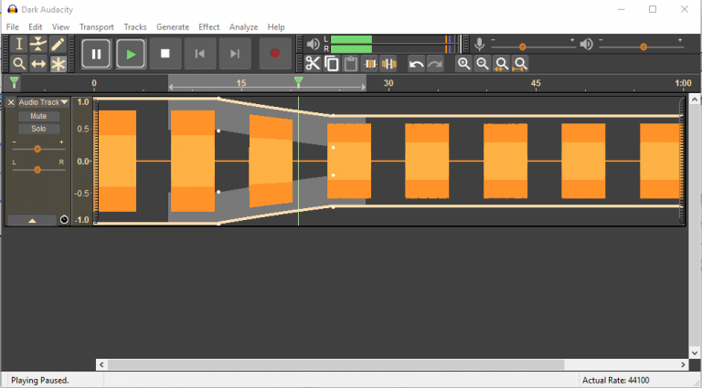
DarkAudacity gives Audacity’s classic audio editor a UI update

DarkAudacity, a mildly redesigned branch of the classic open-source audio editor Audacity, has been released for Windows.
The package has no big technical changes or enhancements, and instead focuses on revamping the interface to simplify operations and give it a more modern look.
Major visual tweaks include a new color scheme, material design icons and the removal of much of Audacity’s UI clutter.
The menus have been shortened, some functions renamed for clarity, and lesser options moved to submenus.
Small practical changes include a simplified "Pause" mode. Click Pause in Audacity and many functions are disabled until you explicitly turn it off; in DarkAudacity, nothing is disabled, and if you choose one of those options the program is smart enough to turn Pause off.
There’s a similar tweak for "Snap To". In Audacity, turning on "Snap To" only allows selecting whole seconds until you turn it off; in DarkAudacity, if you zoom in enough and make a part-second selection, "Snap To" is automatically turned off.
None of this is going to change your life. Some of it might be annoying if you’re used to regular Audacity, and you may not agree with all the changes. Is changing the function name "Record-Append" to "Record-Beside" really going to help anyone?
Despite that, DarkAudacity does look better than its parent project, there are a few welcome improvements here, and the developers have plans for more (easier zoom, smarter looping). Worth the download if you’ve tried Audacity before but gave up, or you’re just looking for a straightforward desktop audio editor.
DarkAudacity is available now for Windows 7 and later.
