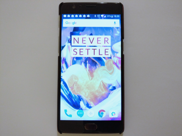
OnePlus 3T first-impressions review

The OnePlus 3T is shaping up to be one of the best smartphones that you can buy today. Replacing the OnePlus 3, it is a slightly beefier version of the former "flagship killer" that, at first glance, also feels more refined. Visually, it looks nearly the same, but the updated internals and improved software could make a big difference in day to day use.
This is a first look at OnePlus' new flagship, which I feel is well needed as the OnePlus 3T today makes its European debut. Many of you will be considering it as your next smartphone, and for good reasons. Obviously, a full review is coming, but until then here are my first impressions.
I only used the OnePlus 3T for a brief period of time and, as a result, I have not had the chance to put it to a serious test just yet. But, after using a OnePlus 3 for a couple of months now, some things quickly stood out.
On the outside, the difference that you will notice from the get-go is that OnePlus has moved to a gray trim (it's called Gunmetal gray) from the silver on the OnePlus 3. That's something that OnePlus discussed when it announced the OnePlus 3T, but here is something that you will not find in the specs sheet: the screen protector that's pre-applied is now wider and covers the whole width of the display.
This was one of the things I mentioned in the OnePlus 3 review, so it is nice to see that OnePlus is listening to feedback. Right now, I see no point in replacing it for another protector, unless you want something beefier.
On the software side, OnePlus has changed a whole lot more. The launcher is a bit different, but not a major departure from the one that's on the OnePlus 3. But if you look in the Settings menu you will find a lot of tweaks.
I should point out that the software on the OnePlus 3T is different to the one on the OnePlus 3 right now. That will be the case until both smartphones get upgraded to Android 7.0 (or 7.1) Nougat. More exactly, the former runs OxygenOS 3.5.3 while the latter is on OxygenOS 3.2.8.
Functionally, not a lot has changed in Settings, but there are some differences that I find noteworthy. First, it's now easier to change the display mode as there's a sub-menu under Display that lets you choose between default and sRGB and also enables you to customize it to suit your liking. Before, the sRGB option was under Developer Options, and there was no customization option.
The customization menu is gone, as the settings that it used to house are now in other menus. For instance, the LED notifications tweaks are found under Notifications and the option to switch to a dark theme is under Display. Speaking of the dark theme, it now has a larger impact on the UI. The Messages app, which is now a OnePlus-designed app instead of Google's Messenger, gets the dark treatment too when the theme is active.
OnePlus also replaced other base apps, like Calculator and Clock, and I have asked the company why it has opted to change direction now. Personally, I like having such apps in Google Play, because they can easily be updated, but functionally OnePlus has an advantage because it can add features that Google does not introduce.
What else is new? There are some new wallpapers, which are nicer than the old ones, a user experience program (which you join by default), and a Community app in the drawer. The last one is added by the latest OxygenOS update, which also comes with a bunch of other changes, like improvements to the GPS, some visual tweaks, and bug fixes.
Something else that's nice is the fact that you can see what's new in a software update after it's applied. There's a "Check Update Log" button in the System Update menu that shows all the changes that OnePlus lists, as well as the full name of your software version (in this case, "OnePlus A3003_28_161122"). By the way, it is still powered by Android 6.0.1 Marshmallow -- Android Nougat will come next month.
Performance-wise, there is not a whole lot that I can say about it now, other than it responds just as fast -- if not faster -- than the OnePlus 3 to the touch. The OnePlus 3 was a beast to begin with, and the OnePlus 3T takes things up a notch, but where this can be felt more may be in power-hungry apps like games.
You can expect a full review soon, but if you have any questions that you want answered now feel free to drop a comment below and I'll follow up with an answer as quickly as possible. You can also reach out via Twitter and email.
Photo Credit: Mihăiță Bamburic
