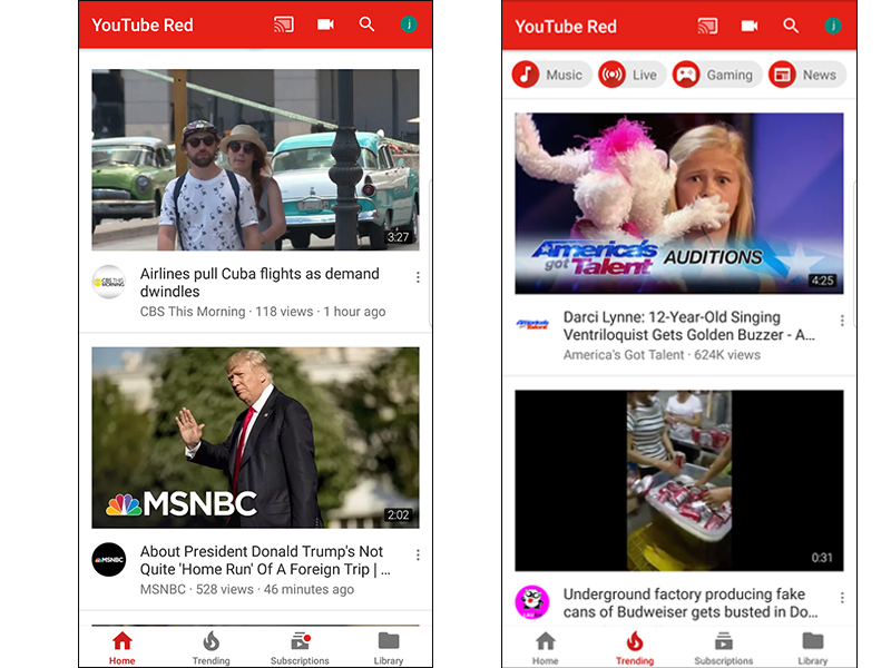
YouTube keeps Android users guessing, updates app

If you have automatic updates enabled on your Android phone, your index fingers and your brain may have hit a moment of panic and confusion as you realized everything was rejiggered from top to bottom, literally.
Par for the course with Google, you will now have to get used to a new interface, different placement of on-screen buttons, and more confusing navigation streams to get to the menu you want. That is, until you get used to it all, at which point you'll appreciate that they were all actual improvements after all.
Previously, the home screen of the YouTube app displayed the main navigation icons (Home, Subscriptions, Account) at the top of the screen. Those have now been moved to the bottom -- except for Account, which has been shifted even higher on the screen, at the top-right corner.
And clicking on Account will no longer give you an option to view the history of videos you've watched, or the videos you've uploaded, or your playlists. Those have all instead been moved with the other navigation buttons at the bottom of the screen, to a new unified "Library" menu. There is also a new Trending button on the home screen as well.
In addition, the top toolbar has also been padded with extra icons for one-click access to the Cast menu at any time (not just when you're in the middle of viewing a video), as well as your device's video camera.
Google is always tweaking its products and is never afraid to roll out major interface updates (remember the introduction of Gmail's unified inbox, two short years after its previous radical update?), knowing that users will eventually get used to whatever it throws at them.
And the updates are generally well-received in the long run; among the other, incontrovertible enhancements also included in the latest YouTube updates are the fact that if you're scrolling through a particularly extensive playlist and you navigate away to a different menu, when you return to that playlist, it will pick up where you left off. And the main navigation buttons are now always visible, preventing the need for excessive back button presses just to be able to navigate to a new menu screen.
More details can be found on YouTube's official community forum post on the update.
https://www.youtube.com/watch?v=2aGE-HcjUwU
