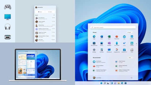
Microsoft shares some of the design ideas behind Windows 11

Windows 11 is almost upon us. While the look may not be radically different to Windows 10 -- evolution over revolution is a phrase you'll hear bandied around -- it is still different enough for the changes to be instantly noticeable.
You may be wondering just how and why Microsoft took the design decisions it did with Windows 11. To help sate this curiosity, the Microsoft Design team has given us a fascinating insight into the process and the philosophy that underpins everything.
See also:
- Want the Windows 10 Start menu in Windows 11? Tough... Microsoft has removed it
- Windows 11 WSL2 performance compares very favorably with bare metal Ubuntu Linux in benchmarks
- Unimpressed with Windows 11? Don't worry... Microsoft says there's 'much more to come'
The peek behind the curtain comes thanks to a blog post on Medium by the Microsoft Design team, where there is talk about "designing the next generation" of the operating system.
There is, of course, a lot more to design than just aesthetics -- important though looks are. Design is also about usability and accessibility, and this is especially true of software in general, but particularly the operating system that you interact with so closely so much of the time. And this is why the Microsoft Design team talks about needing a "deep empathy for current and emerging human needs", factoring in needs exposed by the Coronavirus pandemic.
In the post on Medium, the team says:
This has been one of our most people-driven releases ever and a guiding design principle was based on a key theme surfaced during research: calm technology that makes our lives genuinely better. Calmness is much needed in today’s world, and it tends to hinge on our ability to feel in control, at ease, and trustful. Windows 11 facilitates this through foundational experiences that feel familiar, soften formerly intimidating UI, and increase emotional connection. Experiences that bring you closer to what you love most: family, friends, passions, entertainment, and creations. Windows 11 is where everything comes together, and the need for this has never been stronger.
Much as it has with everything, the pandemic influenced Windows 11. While the rise of mobile technology had nudged the PC away from the spotlight, last year brought it squarely back to center stage. Amid a new virtual paradigm of personal blended with professional, the power and flexibility of PCs enabled us to work from various corners of our homes. It held steadfast as a trusted tool and worthy partner across work, home, and school, quietly awaiting our small moments of brilliance.
The new design -- and positioning -- of the Start menu has proved slightly controversial. But the design team explains that the new location and look is about putting the users in the center and creating a design that was adaptable for different devices.
The post goes on to say:
At Microsoft, these design decisions are not taken lightly. The team obsessed over every pixel; we updated the Start logo to align with our new visual language and leveraged animations to add delight and confidence to the interaction. We were also intentional with the choice of the wallpaper imagery, which welcomes you on boot and complements the new center alignment to make your experience more balanced and focused. We want your journey into Windows 11 to be literally centered from the start.
Listening to feedback, Microsoft learned that people were looking for a softer user interface, and this is what the design language employed in Windows 11 aims to deliver. Simple touches such as warmer color palettes and gently rounded corners has a surprising impact on how Windows 11 feels and how it is received.
The post makes for very interesting reading, and you can check it out here.
