Microsoft is planning a huge overhaul of File Explorer including a redesigned look and new features

It is not all that long ago since Microsoft gave File Explorer something of a revamp with the addition of tabs. Now the company is planning something even bigger, with a dramatically restyled and updated version of the Windows 11 app due for release later this year.
While a precise release date has not yet been revealed, it is likely that the new version of File Explorer will ship as part of either the next Moment update for the operating system, or in Windows 11 23H2. So... what can you look forward to? Better cloud integration, a redesigned toolbar, a new Gallery pane, and a potentially controversial Recommended header.
See also:
- You have just one more week to buy the Windows 10 download from Microsoft
- Microsoft suggests workaround for Start menu and search problems in Windows 10 and Windows 11
- How to activate Windows 11's new, hidden Volume Mixer
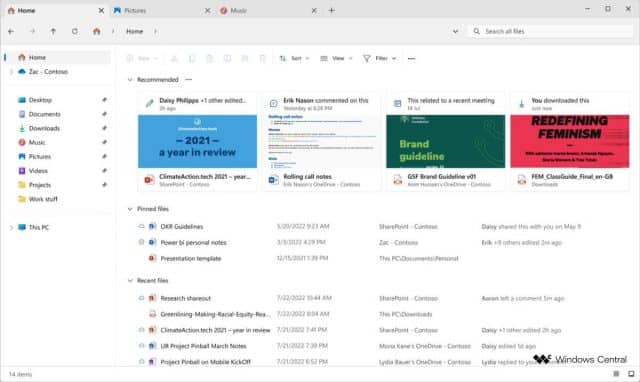
Internal Microsoft imagery obtained by Windows Central may not show a completed design as yet, but it gives a very good idea of the direction in which the company is taking the Windows 11 file browser.
The app's toolbar is in line for something of an overhaul, with the main toolbar at the top of File Explorer being supplemented by a secondary one at the top of the right-hand browsing pane. There is also tighter cloud integration with Microsoft 365 users able to see details about file sharing, related emails and more.
At the top of the main Explorer pane is a new Recommended section. While it seems that this is going to be used to suggest files that users may want to work with based on context, Microsoft's previous abuse of "recommendations" for promotion in the Start menu and elsewhere will mean that this is something that many will eye with suspicion.
For browsing images, there is a new Gallery section that will aid with previewing photos. There are also hints that macOS-style file tagging could be making its way to File Explorer.
Image credit: Windows Central
