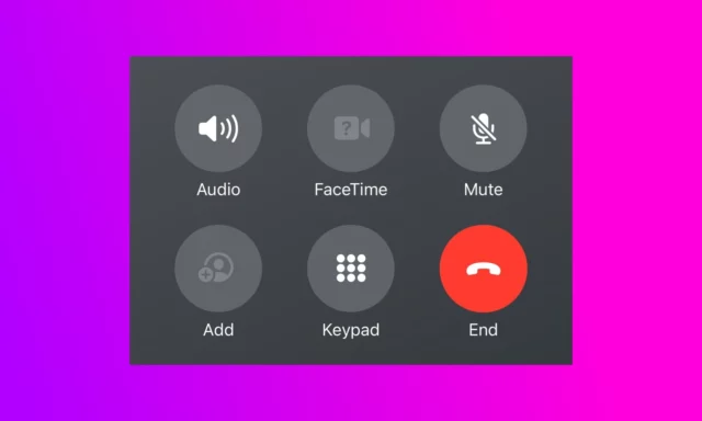
People are mad at Apple for a crazy change to the End Call button in iOS 17

Change is often divisive, and with a UI tweak in iOS 17 Apple is certainly dividing opinion. In the latest beta version of the iPhone operating system, the company has made the decision to move the End Call button.
Shifting the button from the center of the screen -- where it has resided for many, many years -- is causing confusion and wails of discontent from beta testers. Having becomes use to the button being in a central position for well over a decade, users are complaining that the new location is a problem for muscle memory.
See also:
- All Windows 11 users should install the KB5029263 update as soon as possible
- Microsoft drops support for dozens of Intel processors in latest Windows 11 system requirements update
- The latest beta version of Intel graphics drivers collect telemetry by default, including web visits
Apple has not given a reason for changing this element of the iOS user interface so dramatically. On X / Twitter, there is much debate about what could have prompted the decision to make such a significant change to the position of a button that is used by millions of people on a daily basis.
The complaints about moving the End Call button are numerous and varied, although gripes about having to retrain muscle memory are by far the most common.
Other complainants are unable that the change makes iOS look more like Android, but some are more concerned about another aspect of usability. iPhone users who hold their device in their left hand point out that it is virtually impossible for most people with larger versions of the phone to access the button with their left thumb thus making ending a call a two-handed task.
Of course, as this is a beta version of the software, it is entirely possible that things will change before iOS 17 gets a full launch later in the year. And assuming Apple pays attention to feedback, this seems like a redesign that may well be rolled back.
