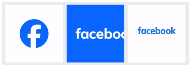
Meta unveils a new Facebook logo, reactions and more

Meta has launched what it describes as a "refreshed identity system for Facebook". This way of referring to a new logo should prepare you for an avalanche of further flowery language, and in this regard Facebook does not disappoint.
What is the purpose of the logo redesign? Meta says it has "a focus on fostering effortless, self-initiated exploration and connection across every touchpoint". The new logo is described as being "bolder, electric and everlasting", but it has already been the subject of some ridicule just hours after launch.
See also:
- Microsoft releases Windows Subsystem for Linux 2.0.0 with fixes and experimental new features
- WhatsApp's new Flows feature lets you shop, book appointments and more from a chat with a business
- Microsoft updates Paint in Windows 11 with support for layers and transparency, and is working on generative AI
You would be forgiven for failing to notice much of a change. Meta has stuck with its custom Facebook Sans typeface, but has made very minor tweaks to its iconic "f". There are adjustments to the openness and tapering at the top of the letter, and a slight shortening of the crossbar. Even Facebook's director of design concedes that these are "subtle" changes, but believes they are "significant" nonetheless. Why? Because it "allowed us to achieve optical balance with a sense of forward movement".

Slightly more noticeable is a change to the background. No longer a subtle graduated blue, Facebook has a new color palette and has opted for a solid blue instead.
On X / Twitter, there has been much mocking of the minor changes, but Facebook says of the revamp:
We crafted a new set of hues, tones and contrast ratios that felt unique to the Facebook brand and are optimized for accessibility. Blue, unsurprisingly, remains the foundational color, and pairs with our expanded spectrum to create stronger distinction for Facebook in marketing and when speaking to people in the app. The deep tonal range of secondary blues allows for flexibility while providing balance as a single expression of our brand identity.
But this is not the only change at Facebook. There are also updates to reactions, icons and other areas of the platform, which Meta attributes largely to its choice of colors:
Through our expanded color palette, we were able to evoke more dimensionality and emotion in Reactions. We adjusted colors to meet color accessibility guidance so that our iconography is legible at any size, flexible enough for different needs and easy for people to interact with. Leaving no pixel unturned, we rebuilt the entire iconography system so that it scales with a wide range of expressions across each moment within the app.
Meta is taking a staggered approach to rolling out its "modernized design language". The company says: "This initial release of design updates to the app includes our redesigned logo and wordmark, as well as an updated color palette, Reactions, typography and iconography -- with more updates to be rolled out in the future".
