Microsoft sexes up Outlook conversations, search, and navigation on iOS and Android

Microsoft is rolling out redesigned versions of the Outlook app for iOS and Android, bringing the cleaner, Windows 10-inspired look, and an improved workflow to mobile users.
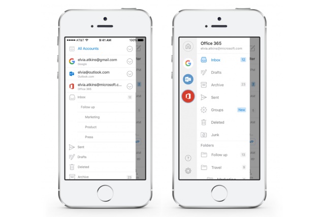
The redesign brings changes to navigation, conversations, and search, with the primary focus being on making it faster to achieve things. Account switching is easier, replying to conversations is streamlined, and the revamped interface is clearer and more spacious.
Redesigned conversations make it easier to catch up on replies that have been sent, with the first unread message now automatically opened by default. Reply Alls are faster to compose, and as you type you can now see the rest of the conversation for reference. It's also much easier to make changes to the list of message recipients.
Navigation between not only folders but also accounts has been dramatically improved as well.
Check out the video below in which Microsoft introduces the latest changes:
https://youtu.be/NArbBkBEkj8
In addition to the changes to conversations and navigation, Microsoft says that there are also important changes to search on the horizon. Microsoft Graph-powered intelligent search capabilities are on the cards, but there is no word on quite when these will be added.
Find out more on the Office blog.
