Facebook News Feed undergoes a redesign to improve readability and navigation

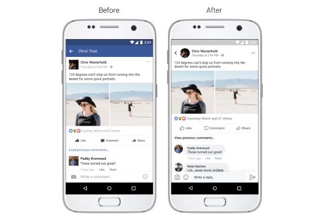
Facebook is rolling out a fairly significant redesign, giving the News Feed a cleaner look, and borrowing ideas from Twitter. The social network says that the changes improve readability and navigation, and they affect various areas.
The redesign is far from insignificant, but perhaps the most instantly noticeable changes are the dropping of blue accents, and the switch to Twitter-style round images. There are, however, more changes to explore.
For the mobile app, there's more borrowing from Twitter. The buttons used to switch between News Feeds, Friend Requests, Market Place and so on, are now cleaner, wireframe icons. In a similar vein, the size of Like and Comment links has been increased to make them easier to hit.
The switch from square to circular profile pictures means there's more white space visible, and this is not the only move to improve overall clarity. When it comes to commenting, there has been something of an overhaul. Comments now appear in chat-style bubbles which make them easier to see, and replies to comments are indented to make them easier to differentiate. A similar change has also be introduced to Instagram.
Facebook also says:
We wanted to improve how people navigate News Feed to create a more consistent experience. We're making it easier to:
- See where a link will take you before clicking on it
- See whose post you're commenting on, reacting to, or reading while you’re in the post
- Return to News Feed once you've finished reading via a more prominent back button
