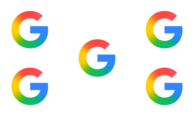
Paint the whole world with a rainbow: Google rolls out new icon design

The Google logo is iconic -- as, indeed, are its icons. Every so often, though, there is an update, a refresh… normally to great fanfare.
But this time around things are a little different. Google has very quietly rolled out a new icon for its search app and has made no fuss about it at all. All of the familiar design aspects are present, but now there is a rainbow gradient.
See also:
- Microsoft continues to foist Copilot on Windows 11 users by adding it to the context menu
- Google is using machine learning to help Android users avoid unwanted and dangerous notifications
- Microsoft is giving Windows 11 users the option to install apps directly from the Start menu
The classic G icon remains instantly recognizable, and the red, yellow, green and blue colors remain in their usual positions. But rather than simply comprising four solid colors, Google has instead opted for a rainbow of color, graduating from one to the next.
The change started to appear in Apple’s App Store over the weekend, and it was followed a short while later by Google’s Play Store.
There are a couple of interesting things to note here. First, it is a little strange that such a striking and noticeable change has not been accompanied by a big announcement. Secondly, it is odd that only the G icon has been changed and not the entire Google logo -- but maybe this is still to come.
