
WhatsApp is changing how read receipts look for iOS and Android users
Read receipts in WhatsApp are getting an upgrade. The two-tick system that appears below the sent message is loved and hated; yes, it lets you know that a message is sending, that it has been received, and that it has been read – but why is there no response now you know that it has been read!?
Putting aside concerns about why someone may be ignoring you, themes in WhatsApp which change the color of the messaging app can be problematic. If you’d become used to read receipts having blue check marks, the fact that some themes changed that had the potential for confusion. Now WhatsApp is addressing this.
When WhatsApp added the ability to use themes to customize the look of individual chats, the decision was taken to change the color of the check marks to help improve visibility. But different colored read receipts in different chats also had the unwanted side effect of making it harder to quickly determine the status of a particular message, especially when switching between several chats using different themes.
Now, as reported by WABetaInfo, WhatsApp is testing the ground and changing the way read receipts look:
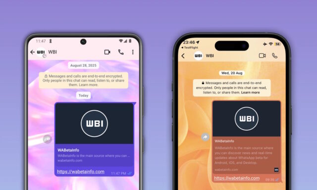
In the past, read receipts in certain themes were displayed in white instead of the traditional blue. This change was implemented because blue checkmarks did not harmonize with the colors of some message bubbles. WhatsApp initially decided to override the default blue color in some chat themes to improve visual accessibility, ensuring that read receipts stood out against the background through a white color.
However, while this change aimed to address certain accessibility concerns, it introduced new issues for some users. When a message was delivered but not yet read, the checkmarks were gray. Once the message was read, the checkmarks turned white in specific chat themes. The distinction between gray and white was subtle, making it harder for users to quickly recognize whether a message had been read. Many users found this less intuitive and expressed a preference for returning to blue read receipts.
In response to this feedback, WhatsApp is now testing blue read receipts across all chat themes for both iOS and Android users.
It is certainly much easier for most people to distinguish between grey and blue than it is between grey and white, but it is not a change that will necessarily roll out to everyone.
Right now, only a select group of people using the latest beta versions of the WhatsApp mobile apps are seeing the change, suggesting that A/B testing is underway.
Does this feel like an improvement to you, or did you prefer the old style of read receipt?