Twitter gets an online interface revamp for 2014

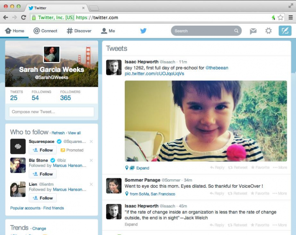
It was announced very casually with very little fanfare. Twitter is getting a new look. It is in the process of rolling out around the world and when the revamped interface hits your account you'll find that the new look closely mimics that found in the iOS and Android apps. The redesign follows a recent update to the mobile apps, and while there are not many dramatic changes, the standardized look helps to create a more uniform experience moving between devices.
The tweet composition section is now found to the left hand side of the screen -- gone is the pop-up box in favour of an inline option. The two-column design has a very neat look to it, and does an excellent job of keeping related data together. The left hand column houses the profile box and composition field, and beneath this you'll find suggestions for who to follow, as well as a list of trending topics.
The right hand side is where the magic happens; this column is dedicated to your tweet stream. A navigation bar at the very top of the page is borrowed from the mobile apps and provides easy access to different sections of your account. There's also a 'compose tweet' button that activates a familiar pop-out compose window for anyone who prefers the old style of working.
Overall, there is a much lighter feel in the new design. Colors are lighter, but buttons and navigations are subtler than in previous versions of the site. If you don't see the new look in your account yet, just be patient and it'll arrive in due course.
Of course, an important question needs to be asked: what do you make of it?
