The once and future king: Test build of Opera crushes Chrome on Windows 7
![]()
How's this for a Christmas miracle: We've been saying that if Opera wants to get back in the game -- if it truly wants to earn a place among the Top 5 positions on Europe's forthcoming "Choice Screen" -- then it has to pick up the pace in the performance department. Apparently while we were writing that, the developers at Opera Software were a little ahead of us on that count.
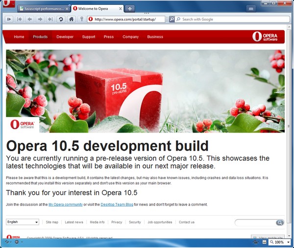
It's rare that any company should release a product for the public's inspection under the guise of "pre-alpha," but what we expect it to mean for now is, "Don't use this as a browser yet." So we won't: For now, we won't consider the pre-alpha build of Opera 10.5 -- leaked earlier this week, but officially released this morning -- as a browser that is ready to be tested in real-world scenarios. Opera is testing yet another completely new chassis, one which borrows a few ideas from Google Chrome and a few others from its own Opera Mini and Opera Mobile products. And as we discovered for ourselves -- not shockingly -- it's not a complete product, quite capable of bizarre behavior. That's what the "pre-" means, apparently.
However...What's brewing under Opera's new hood is something astonishing: three replacement libraries including a new rendering engine and a new JavaScript engine. One wonders why they're not calling this "Opera 11."

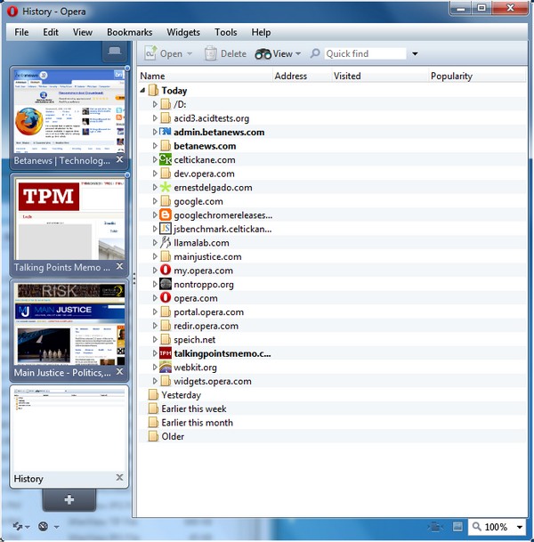
The new look of Opera 10.5 (if this is indeed representative of the first test build's appearance) is handsome. The menu bar has completely disappeared, having been absorbed into the "Big-Red-O" button in the upper left corner. Service windows such as Bookmarks, Downloads, and History are accessible from this button. You can bring the menu bar back from here, if you wish; if you do that, the "Big-Red-O" disappears.

Tabs take over the top title bar, and the sliding thumbnail previews introduced in Opera 10 appear here too. You can also adjust the tab/thumbnails bar to appear along the left side, and in 10.5, the glassy background applies here as well for Windows 7. In our tests, playing around with the title/thumbnails area too much, crashes the browser. That's to be expected from this very early build. Opera Software is advising curious testers to use extreme caution: "Do not run in hydroelectric power plants."

It's a handsome environment for the new browser, and if they get it working and clear up some of the loose ends, it could be a functional one as well. The original left-hand optional sidebar concept appears to be missing in this build, but in its place is a system where the user can create fully customizable toolbars, thus fulfilling the same purpose.
This is the level of customization and functionality that Google Chrome users have been aching for -- the possibility of a lightning fast browser that runs in something other than a plain blue box. If Google doesn't watch out, Opera is going to answer Chrome's users with what they've been asking for all year.
Next: Opera's last-second Christmas present...
