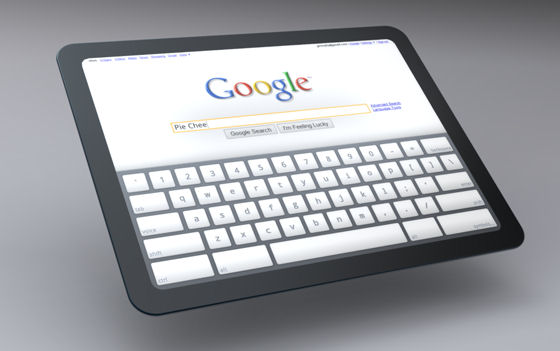
Google drops clues on more document-centric Chrome OS for tablets

Since the development of X, one of the first windowing UIs for UNIX, and as evidenced by Apple's early experiments with Lisa, the forerunner of Macintosh, software designers have been intrigued by the concept of a document-centric computing environment. More like a physical desktop, such a system would center not around the programs you launch but the work you do. The functions and applications pertaining to that work would pop up in the margins, but most of the time would stay out of the way.
That's the old-fashioned idea that the designers behind the Chromium OS project -- the open source team whose work feeds into Google's Chrome OS -- are now publicly experimenting with. With only a few crude mockups to show off today, the crew appears to be considering an environment that's scalable to any size tablet, where the document consumes the entire screen, but the functions and apps are tucked away either outside the margins or through zoomable context menus.
The mockups released today -- none of which appear rooted in any actual code -- would actually do away with the tabbed interface that has come to symbolize the Chrome browser, and the Chrome OS demos we've seen thus far. In its place, the document or Web page the user's working on at the moment, is maximized to full size. A cafeteria-style menu similar to how Alt+Tab works in Microsoft Windows, or how albums are selected in iTunes, lets the user switch between active documents. But if what we're seeing is an accurate representation of the Chromium team's ideas, the user wouldn't be switching between applications (e.g., Google Docs word processor, Chrome Web browser, Picasa photo selector) but rather open documents (e.g., a photograph, a Web page, another Web page, a Twitter feed, a document being edited).
How one wants to edit or view a document may depend, judging from the Chromium team's undescribed mockups, on the service the user chooses. That choice of familiar services (Facebook, Lala, Pandora, calendar, tasks) shows up not on the root menu or Start menu or the base of the desktop, but in a popup menu that appears in the context of the open document. This suggests that the design team is going back to a very old drawing board indeed, reconsidering some of the design elements first implemented by the original Apple Lisa.
A computing environment that is much less "app-centric," or that plays down desktop apps in favor of Web services, would play much more to Google's strengths than Microsoft's. Google might not necessarily have a built-in advantage with respect to productivity applications in a Web-centered world, but neither does Microsoft at this point, so the odds would be more even.
A video produced by the team, strangely, takes a different approach than the mockup photos, and may in our opinion have been produced by a different contributor to the project. It shows a more conventional, app-centric model of applications sharing real estate on a very large tablet, the size of a big-screen HDTV.
Running applications would be represented by tab-like protrusions from the window's left side; and in the video (unlike the stills), apps would remain more contiguous. So the RSS feed and the Gmail front-end would still belong to the Web browser, which in the video is represented by the left window. However, one common element remains the "Quick Access" window, which pulls double-duty in the video: It lets the user either pull up services such as Facebook, or initiate Google searches for unknown items.
We look for clues anywhere we can find them, and since we were scouring the Chromium team photos for anything and everything, we honed in on the common element of the photos and the video: the mock Google search for "pie cheese." In a few of the photos, the search is incomplete, and reads merely "pie chee." Wondering where we'd heard that before, and being stumped for a moment by the phrase rhyming with "Tai Chi," we remembered that something one letter off -- pee chee -- is an inexpensive, card-stock folder used to store loose-leaf papers. It would be about the size of one of the tablets in Google's mockup, and may even be an appropriate name for the thing if certain folks would refrain from giggling.