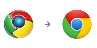
Chrome 11 shines up new logo, stable build

Earlier this week, Google updated its popular web browser Chrome to version 11. The latest stable release, which sports a new "flattened" version of the program icon, has one major headline feature: support for text-to-speech in supported web pages. This new feature, designed for those who have difficulty using keyboards, is based on HTML5 technology -- and works on web pages where a microphone icon has been embedded into a text or form field. It currently only supports English as a language.
The feature works by the user clicking the microphone icon before speaking into their mic. Chrome then converts this into text and pastes it into the field. Supported websites are currently thin on the ground, but it can be tested at HTML Rocks or by selecting English as the "From" language at Google Translate.
Other changes in Google Chrome 11 include hardware acceleration for 3D CSS, bug fixes for the cloud print function and a security update for the integrated Adobe Flash plug-in. There are also 25 new security fixes introduced between the jump from beta to stable.
Google Chrome 11 Stable is a free download for Windows, Mac and Linux.
Editor adds: In March, we asked Betanews readers if they liked the new Chrome logo. To date there are 2,742 responses, with 49 percent of respondents preferring the older logo. Only one-third of you prefer the new, flattened logo. The embedded survey gives you another chance to vote. Timing is appropriate since the new logo has made its official debut.
"The older one has pizzaz to it," purplemaize commented to the logo change story. "They should keep it -- that is what Chrome is all about -- not about plain Jane." Shallot doesn't like the new logo or our poll: "I don't think Google even spent so much time thinking when they changed the logo. And I don't think they will give a hoot as to the verdit of this time wasting poll. Who the f*** cares !"
Scott Johnson opined: "Not sure I like either. The old one never grabbed my attention. And the new one is both better and worse. It's simpler (good), but retro in a way that doesn't work. And it's still awfully Microsoft-esque. Same 4 colors. It looks like a cross between the Windows logo and the old Simon game."
Simon you say? We agree with that.
Get more software news like this at Software Crew.
