Apple iOS 6 Maps -- headed in the wrong direction [review]
 I upgraded one of my Apple devices to iOS6 last night and the first thing I did, once finished setting it up, was to launch the new Maps component. This, as you’ll no doubt be aware, replaces the aging Google Maps app. I knew from other articles I’d read previously that Apple’s own mapping service wasn’t going to be as good as the old Google one. After all, Apple is new to this mapping lark, and the search giant has years of experience in the field. But I was prepared to give it the benefit of the doubt, and forgive any minor problems. After all, how bad could it be?
I started, as I am sure most people do, by typing in my address. Well, actually as I live in the United Kingdom I typed in my post code. Apple found my road, Prince’s Drive, but decided it was called Princess Drive. Not the most auspicious of starts.
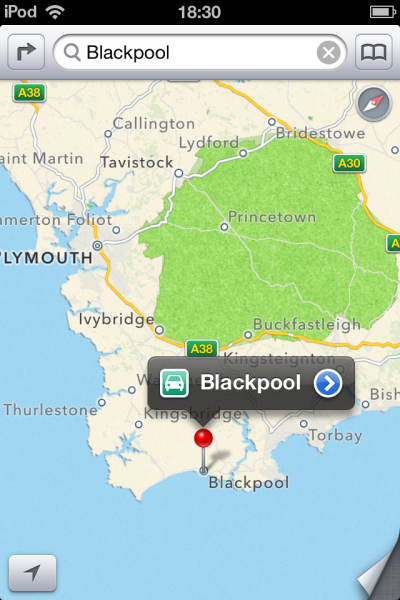
Since my wife suggested it might be nice for us to take a drive to the seaside town of Blackpool to see the famous Illuminations later in the year, I decided to get the route for there. Apple Maps offers a new turn-by-turn direction system that guides you along the route. This is quite nice, with each step shown in a box at the top of the screen (including the distance to travel and the action to take) and where you currently are displayed on the map below. I cheerfully drove along the virtual route, thinking "Hey, this is all pretty well done, I like this", when I noticed something odd. Blackpool is on the northwest coast of England. Apple Maps directed me to the South -- a four-and-a-half hour, 248-mile, detour in the wrong direction.
I explored the map further and found other errors. Incorrectly named places and cities in the wrong location. Not just in the United Kingdom, but around the world. I then spent an entertaining hour just typing in place names and watching as the pin stabbed down on the map in what seemed increasingly like the work of a blindfolded drunk having a good old guess.
Actually, that’s slightly unfair. Apple did correctly identify most of the places I searched for, but when the errors I encountered reached double-figures I decided the app was not to be trusted and went onto Twitter, which was, naturally, all abuzz with complaints and humorous observations about the shonky new app. I was particularly thrilled to discover this Tumblr highlighting some of the better finds.
It’s not just incorrect names and locations that mar the new app. Apple’s maps are just so much poorer than Google’s. There’s less clarity and fewer details, fuzzier satellite imagery, and of course nothing to compare to Google Street view. It is, in a nutshell, a huge downgrade.
And the problem is it’s so far behind what Google offers that I just can’t see it ever getting good enough to compete. Apple is supposedly all about the user experience, but here it’s replaced a great experience with a poor one. Like swapping the old YouTube app with Tim Cook’s VHS collection or giving users MySpace in place of Facebook.
