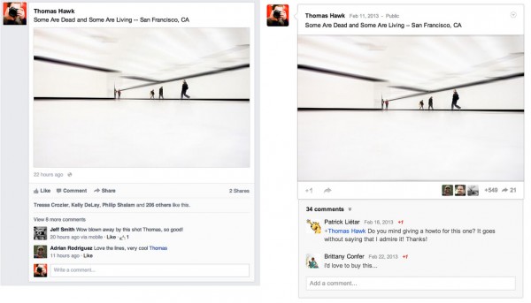
Facebook clones Google+
Three days ago, I told you "Suddenly, Facebook looks more like Google+, only better", based on the product launch demos. But seeing is really believing. Photographer Thomas Hawk, whom I've followed online for a long time, has the new FB News Feed. His side-by-side shot of the two social networks is a real shocker. You're not seeing double.
I suppose there are few obvious ways to present big, bold images in the feed and supporting links around them. But this copycatting is something. "Content in the new news feed feels a lot like Google+", Hawk explains. "I’m not saying Facebook copied Google+ here, and imitation is, of course, the sincerest form of flattery and all that, but check out the two content envelopes side by side in the photo...They are pretty darn close".
Hawk's "Unboxing the New Facebook News Feed" is an excellent resource for anyone who wants to really know what to expect.
Unfortunately, I don't have the redesign, although I signed up last week. In December, I planned to close my account, but right at the end of the year, my 91 year-old father-in-law needed to be hospitalized. I spent little time online the last days of 2012. So the New Year came with my FB live but inactive. I just left it that way. The upside: I can eventually write firsthand about the dramatic redesign.
As I explained last week, the redesigned News Feed is more than about mimicking Google+. Facebook also creates more white space for placing contextual ads, as Hawk observes from his experience: "Pictures are bigger and stand out more, but unfortunately so do all of those crappy memes and worse, sponsored posts (ugh! advertising — the new advertisement for McDonald’s new fish McNuggets feels even more intrusive). Please Facebook, let us pay you for a Pro account and let us opt out of all the horrible ads".
Pro account is a fool's dream, Thomas. My wife said to me this morning, while deleting old messages: "I really don't understand Facebook". I told her that she needs to grasp but one thing, and then everything about the social network is clear.
The genius of Facebook is this: Unlike, say, newspapers that generate content and pay people to do so, the social network gets all the content for free and then profits from it. That's where Facebook and Google are quite similar, with regards to generating revenue. Google indexes content other people create and wraps contextual advertising around it.
Facebook can do even more, because the company knows more about you and can enable partners -- be they app developers or marketers -- to contextually target goods or services to you. The redesign is all about making this easier, which is why there is more white space and uniform look and feel across devices -- PCs, smartphones and tablets.
Facebook has more to gain from contextually hawking (no pun intended, Thomas) stuff around your content than let you pay X dollars a year to opt out.
Just to be safe, with Google+ growing fast, Facebook also lifts some of the better UI concepts. Since FB is the larger, more-established social network (hey, 1 billion users, baby), the need is to simply keep people. Since most anyone most of us knows is already on Facebook, changing social networks is harder, even if complexity and privacy issues are reasons to. For those of you who have switched and try to get friends and family to come along, the new News Feed makes the task harder because the benefits of the new thing are less obvious, while the benefits of hanging out with everyone else are crystal clear.
Image Credit: Thomas Hawk

