Meet the Amazon Kindle Fire HDX 7 [Review]

There is no shortage of variety in today's Android tablet market. Devices come in a range of functionality and price, and from a host of makers. Two prominent tablets on the market are from a couple of the web's biggest sites, and both Amazon and Google are hoping their devices will land under your tree this holiday season.
The second generation of the Nexus 7, manufactured by Asus and sold by Google, has been on the market for some time, but now Amazon is pushing the third version of the Kindle Fire tablet. This latest iteration is, of course, purported to be the best, but is it? Can the HDX really be better than the 2012 HD?
Head-to-Head HD vs HDX
We are not going to focus on specs. You can find those anywhere. Instead, let's compare devices, side by side. The size (seven inches) and shape of the two models are identical, but the similarities stop there.
The most obvious change is along the edges and even that is an understated design difference. While the old tablet is rounded, the Kindle Fire HDX has a bevel. It's not a huge deal, but it makes a difference in the feel of the tablet in your hand. It means the edges are thinner, making it easier to hold onto.
The buttons are another big design change. The Kindle Fire HD contains volume and power switches -- one under the other -- on the right side of the device, and they are flush with the edge, making it difficult to find by touch. The HDX shakes this design up a bit, making the buttons much easier to access.
While the volume remains on the right-hand side, the power switch has moved to the left and both have received an indentation that allows them to be located without having to turn the tablet on its edge so you can look for them.

The speakers on the rear have also moved. While there are still two of them, one on each side, they have relocated from the middle of the device to the top. It's an improvement because holding the device no longer lends itself to having your fingers partially blocking the sound.
Like its predecessor, the HDX has a front-facing camera, but no rear lens. It also contains a much larger Amazon logo emblazoned across the center of the rear.
![WP_20131123_09_50_04_Pro[1] WP_20131123_09_50_04_Pro[1]](https://betanews.com/wp-content/uploads/2013/11/WP_20131123_09_50_04_Pro1-600x337.jpg)
The New User Interface
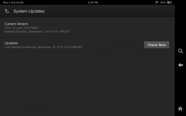
Since its release, the Kindle Fire HDX has already received an update, taking Fire OS to version 3.1. The change added Goodreads, the popular social book service now owned by Amazon. There is also new second-screen functionality and better integration for enterprise.

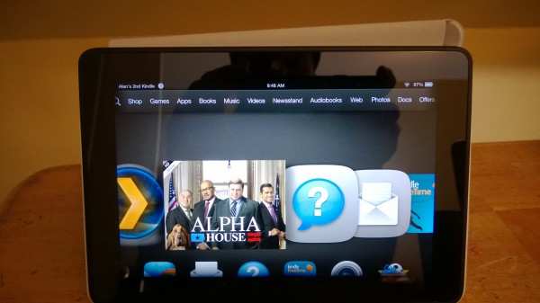
While those changes are all nice, the real differences came with 3.0, which launched with the new tablet. The familiar top menu is still there, and can still be swiped down for additional options. The center, which is the main part of the screen, also remains unchanged, allowing you to swipe left and right to find your apps. A Quiet Time option has been added for easily muting the device.
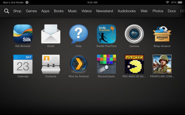
However, a new swipe-up feature reveals an addition -- an Android-style app drawer. It makes it easier to access apps like the Silk browser, Shop Amazon, and open the camera, calendar, contacts and whatever you have chosen to install.

Mayday, Mayday!
A feature that has received considerable attention is the new Mayday button. It's accessed by swiping the top menu down and hitting the option that now resides there.
I gave this a real-world test after installing Plex on the Kindle Fire HD and not finding it listed under "cloud" in the app store on the HDX, though all other apps were ready and waiting.
The service is available 24/7 and Amazon promises a quick reply from one of its technical support representatives. The retailer did indeed answer very quickly and video displayed the young woman with whom I was speaking, though the video is one-way, as I was not visible to the rep.
However, when I inquired about the missing app I was told that Plex license was only for one device. It was a logical and quick answer, but it also turned out to be wrong, as the app finally made an appearance on the HDX a couple of days later. It is working just fine on both tablets, not to mention a second-gen Nexus 7 and a Nexus 5.
Conclusion
I confess to being a big fan of the Kindle Fire HD. It is a highly customized version of Android -- almost unrecognizable, in fact. But if you are a customer of Amazon Prime, then the tablet must be given serious consideration because of its tight integration with the service. The HDX only enhances this perception, with better features and a huge design improvement in the form of the buttons.
