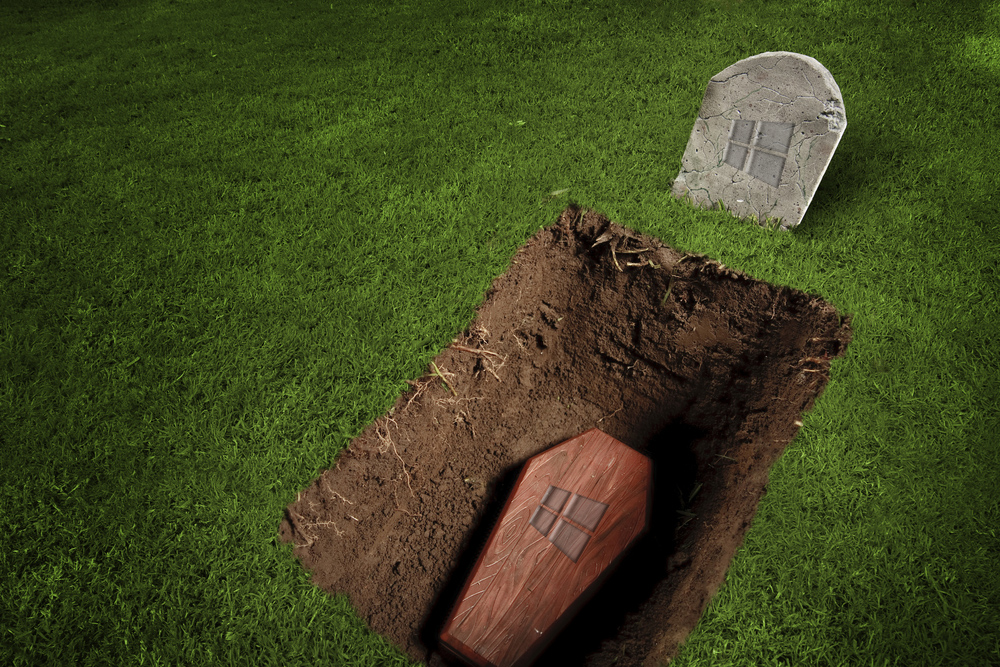
Windows 8.1 Update is the final nail in the coffin

Windows 8.1 Update. Windows 8.1 Update 1. Windows Feature Pack. Windows 8.1 Service Pack 1. Call it what you will, the big update to Windows 8.1 is just around the corner and it promises much. Or at least it did. It was revealed yesterday that it was possible to get hold of the update ahead of schedule with a quick and simple registry edit -- or by downloading the necessary files from the numerous mirrors that quickly sprang up -- and it appears that this is final code; the RTM version that will hit Windows Update for the masses very soon. Was it worth the wait?
This update was Microsoft's chance to put things right, to win back people who hated Windows 8 and have failed to be won over by 8.1. I make no secret about having a love-hate relationship with Windows 8.x. There have been parts of Windows 8 -- particularly the Metro/modern side of things -- which I disliked from day one, but for the most part I have been able to just avoid using them. Microsoft has even acknowledged that people want to avoid the Start screen whenever possible, and has provided tips on how to do so.
Like many others, I jumped through the necessary hoops, grabbed the required files from Windows Update and I'm now running Windows 8.1 with the Update installed. I boot straight to the desktop, so what's the first noticeable change having installed the update? Oh, there's a bright green icon screaming for attention in the taskbar. What’s all that about? Ah… the Store link. Great. That'll come in handy for all of the modern apps I don’t install. But as I've noticed it, why not give it a click and see if anything else is new. As we knew from earlier leaks, modern apps now have a pseudo titlebar like 'legacy' apps (sidenote -- why in the name of sweet hell are they 'legacy' apps? Legacy? They're the most commonly used apps!). Except it's not visual all of the time and it doesn’t act like other titlebars.
In a regular app (I am, henceforth, refusing to use the word 'legacy') one can use the titlebar to drag and drop apps to new positions. Not with modern apps. In regular apps, right clicking a titlebar displays a context menu. Not in modern apps. Again Microsoft gets it wrong. In trying to clear the boundaries between modern and regular apps, the company has merely succeeded in highlighting just how different they are and creating a strange experience for anyone unfortunate enough to find that they use both types.
The lack of Start menu is something that sits uncomfortably with many users. The release of Windows 8.1 addressed the issue to some degree by reintroducing the Start button, but this was not really enough. The new update makes another tweak. The Start button is still present, and clicking it still brings up the Start screen. The change is that the taskbar remains visible when the Start screen appears; it's almost like having a full-screen Start menu. But move the mouse to click on something and… wait… what’s that? The taskbar has disappeared? WTF?!
For anyone with a preference for working in desktop mode, this disjointed weirdness merely exacerbates a problem that has been present for some time -- the idea that Windows 8.x just doesn't seem to know what it wants to be. The strange hybrid beast that has been created is worse than the Frankenstein's monster it has has been likened to. It's just a bloody mess. Accusations of being bolted together are nothing new, but it is astonishing that Microsoft can consider this a completed product and be happy to put its name to the update. This was meant to be the one update to rule them all -- in reality it has just fucked things up. There is really no politer way to put it.
There have been complaints, whinges and grumbles about the fact that the Start screen has not featured a shutdown option. Well, fear not! This is addressed in the Update! Oh wait… no it's not. My mistake. Yes, there is now a shutdown option, but it is very awkward and the 'workflow' of getting to it is just absurd. Click the Start button at the bottom left of the screen. If the Start screen is configured to go to App view you will then need to switch to the other screen. Then the power icon is visible, nestled in the upper right hand corner of the screen -- the opposite bloody corner to the Start button! Do you not believe in efficiency, Microsoft?! -- which can finally be tapped or clicked to restart or shutdown. I need a lie down after that.
Windows 8.1 Update is a Band-Aid holding together an already patched up operating system. There had better be some seriously impressive plans in store for Windows 9 -- or maybe even another update to the 8.x range -- because Microsoft is putting its famous franchise in danger of becoming even more of a laughing stock than it currently is. And yet I continue to use it! Is there something wrong with me? When will I start to listen to my own advice and spend more time with OS X and Chrome OS? The Update is a joke. It smacks of Microsoft desperately scrabbling to correct its mistakes and failing -- dramatically -- to do so. This is a poor patch for a broken operating system. Go home Microsoft, you're drunk.
Did you bite the bullet and install the Update? Did it live up to expectations (did you have high ones?) or was it a disappointment?
Image Credit: Fer Gregory/Shutterstock
