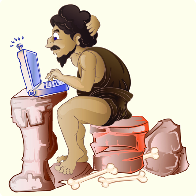
Threshold: Windows for the Neanderthal set

What’s with all this excitement over Windows "Threshold"? I get it that Microsoft sort of fumbled the ball with Windows 8. I also recognize that the subsequent tweaks and retrofits (Windows 8.1, Windows 8.1 Update 1, Windows 8.1 Not-Update-2, et al) are viewed by many as "too little, too late" to save the product.
However, I’m sensing a deeper disturbance in the force here. When it comes to Windows Threshold, there’s a palpable aura of anticipation -- a kind of electric expectancy, and its emanating from what I like to call the "Neanderthal set".
You know the type. The IT dinosaurs. The throwbacks. The forty year old virgin basement dwellers who sneer at your iPad as they skulk by in the hallway, hunched over from the weight of their overstuffed LINO (Laptop in Name Only) cases like Quasimodo in a Polo shirt and boat shoes.
These people hate all things multi-touch, especially that dysfunctional, partial-birth abortion of an OS known as Windows 8.x. And now, with blood in the water from an endless stream of negative Windows 8.x media coverage, they sense impending victory in the form of Threshold.
With Threshold, Microsoft is coming full circle in its "mea culpa" tour by hosing-off the last traces of Sinofsky-stink. Start menu back? Check. Windowed "modern" apps? Check. A complete masking of all vestiges of Windows 8.x’s controversial Start screen, Settings pages and Charms bar? Check, check and check.
In fact, by the time Microsoft is done gutting all of the default touchy-feeliness from Windows 8.x’s successor, the product will be nearly indistinguishable from Windows 7 (aside from the whole "Aero-is-dead" thing). All of which is exactly what the Neanderthals want.
The problem is that they’re wrong. I mean, really, really wrong. Windows doesn’t need less multi-touch support -- it needs more. This is especially true if the platform is to remain relevant in a shifting Post-PC landscape. However, instead of looking forward -- by deepening Windows’ multi-touch roots and touting the advantages of the upcoming touch-based Office for Windows devices -- Microsoft is looking backwards in a vain attempt to silence its critics and shore up a rapidly shrinking enterprise base.
To cite a political analogy, the Redmond behemoth is behaving like a wishy-washy, middle-of-the-road politician who’s being forced to kowtow to an extreme (yet faithful) core when in reality they should be expanding their reach by embracing newer, more progressive positions on key issues.
History shows that few products (or politicians) succeed when they try to be all things to all people (though Mr. Obama comes close). Microsoft needs to stick to its original plan and focus on the future, not the past. And that means ignoring the cries of the Neanderthal base and restoring innovative multi-touch features, like the Charms bar.
Personally, I like the Charms bar concept. It provides a consistent location for app-specific settings and important, system-wide functions. But then I like a lot of things about the current Windows 8.x UI, including the Start page, snapped windows and even full-screen Internet Explorer. And lest my bona fides be questioned, I would point out that I’ve been writing professionally about all versions of Windows for over 20 years, and that I’ve also developed commercial software at every level of the Microsoft software stack.
In other words, if a died-in-the-wool, mouse-and-keyboard junky like me can evolve to embrace Microsoft’s once bold multi-touch vision, so can other Neanderthals. Unfortunately, they’re all too busy cutting the company off at the knees when in truth they should be rallying behind the one vendor who might actually get multi-touch "right". Because the alternative is more iOS, more Android, and more headaches for IT.
Image Credit: djapart/Shutterstock
