One Week Later: Windows 10 Technical Preview for Phones on my daily Lumia 925
Microsoft made it pretty clear: Windows 10 Technical Preview for Phones is still only meant for serious technical testers only. Of anything I've learned after one full week using my daily Lumia 925 on the preview release, it's that this OS is far from ready for primetime. But that's not necessarily a bad thing, per se.
I decided to write up some of my thoughts about Windows 10 Technical Preview for Phones 10051 before I rolled back my phone to Windows Phone 8.1. Yes, willingly, I spent the last work week using my daily Lumia 925 on preview build 10051, the latest and only second release Microsoft has publicly doled out for the community.
The first preview release was extremely underwhelming, only including a handful of phone models, many of which are either extremely new or used by a minority of Windows Phone users. But with 10051, Microsoft finally opened the gates to the rest of us (well, most of the rest) and I decided to play guinea pig.
As a relatively unabashed Windows Phone fan since I publicly and unapologetically ditched Android in late 2013, I figured I had little to lose here. If I'm going to be running Windows 10 for Phone at some point this year, I might as well get some familiarity with what's coming, right?
That was the thought. And I'm not going to hold the release's bugs against Microsoft because, as they warned, I shouldn't have chosen to use this on my daily phone but did so anyway. My opinion of the OS as it stands right now takes that into account, and I'm merely offering up the areas where the OS shines, where it doesn't yet, and most importantly: what the preview hints at for the biggest changes coming to Windows Phone as a platform.
The Install Process
Seeing as I was already running the latest, greatest version of Windows Phone 8.1, moving up to the Windows 10 for Phone preview wasn't that difficult at all. I downloaded the new Windows Insider app which replaces the former Preview for Developers app, and after a reboot or two, was able to see the phone preparing the download for the new test OS release.
Little did I know, I actually first received Windows Phone 8.1.2 (or 8.1 GDR2) on my Lumia 925 before build 10051 of the Preview release was loaded on. I'm not entirely sure why this happened, but many people seem to be reporting on it widely thus far. Paul Thurrott has an excellent walkthrough of 8.1.2 if you're interested in the last big hoorah for Windows Phone 8.1.
Once I had Windows Phone 8.1.2., the update process began again, and finally loaded the bulk of the update in the first go-around which took about an hour from start to finish. There was a smaller, secondary update which came after the first major install was done, which seemed to be called a Configuration Update of some sort. I'm not sure what it pushed down, but it was quick to put on and was seamless.
Lack of Cell Data: Why I Had to Clean Install
One of the most frustrating initial aspects holding back my adventure on Windows 10 Technical Preview for Phones was cellular data which seemed dead in the water after a single reboot post installation. It was as if my phone had no idea of how to connect up to Tmobile for data. Regular texting and calling seemed OK, but LTE for all it was worth seemed to be gone entirely.
I scoured the Windows Central forums for hours trying to see if anyone else had encountered the same mess of a result, and numerous threads referenced the issue. There were a few tricks that worked for some, namely creating a fake APN to trick the phone and then delete it, but it was fruitless.
I took other suggestions to wipe the phone and reinstall the preview build, this time refusing to use my backup to restore from (for app data, settings, etc). No go. I tried a few more hard resets, thinking that it was maybe a fluke.
After losing most of my Saturday pulling my hair out about a lack of data, I finally took another user's advice and went back all the way 8.1 on a fresh install, THEN upgraded up cleanly to 10051 without choosing to bring back any backed up data.
For one reason or another, that last attempt did the trick. It seems that there was some deep down APN or data settings which just refused to work properly without coming off a clean 8.1 install and moving directly up to 10051. Regardless, it was about Saturday late afternoon by the time I had my cell data issue under control.
I spent the better part of Saturday evening and some of Sunday morning finalizing the way I wanted things, so I could start my work week on Windows 10 Technical Preview for Phones 10051.
The weeklong experiment has come to an end, and here's what I love -- and don't -- about the next iteration for Windows on the handset.
The Bright Spots: Action Center; Universal Apps; and Familiarity
One of the biggest things that Windows 10 for Phones has going for it so far? Keeping the best of what made Windows Phone 8.1 unique and special over that of Android and iPhone. I had a fear that Microsoft was going to make some changes to Windows 10 for Phones that would be too far away from what I grew to love about Windows Phone. Luckily, most of the former's guts are present, with some welcome changes in other areas.
By far the biggest positive differentiating aspect about Windows 10 for Phones is its inherent design around the concept of Live Tiles, an ever-present feature spanning all Windows interfaces since Windows 8. While it got a lot of heat on the desktop, it's absolutely refreshing on a cell phone, and is so much easier on the eyes, and the fingers, compared to the drivel that Android/iPhone consider "app organization."
Not too much about that concept has changed on Win 10 for Phones. The option to have even more tile space is still present, a holdover from Win Phone 8.1, which allows for greater tile density and sizing options. Not all apps support the bevy of sizes Microsoft allows for, but it's only a matter of time until this spans the entire ecosystem of Universal Apps that will soon become ubiquitous over the Windows world.
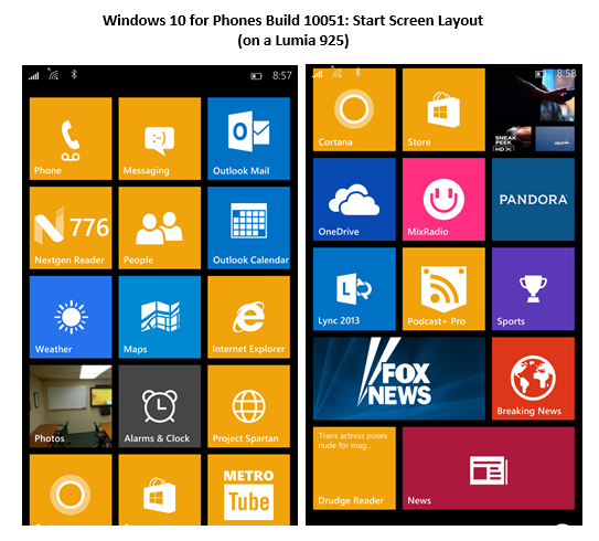
The Windows 10 for Phones Start Screen interface, complete with Live Tiles, is still front and center in this iteration. Windows Phone 8.1 introduced the option to have even more tile sizing options, and that facet is still present in the preview release. One lacking feature? Complete tile transparency which was so cool about Win Phone 8.1. Not entirely sure why Microsoft decided to remove the option, as I grew to love it.
This whole concept of Universal Apps is still a bit fuzzy, as there's not much of it present yet in Windows 10 for Phones. The biggest new examples are the Outlook Mail and Calendar apps, along with the new Maps app, which will be sharing center stage with the upcoming Office Touch apps.
The new Outlook apps definitely expand on the feature set which was a tad limited with the older integrated email/calendaring from within Windows Phone 8.1, but they are currently plagued by speed issues and a nasty bug which, for some reason, forces you into the Calendar app even though you intended to go into a new mail item from the Action Center. I'm hoping that's a temporary issue.
The formatting options and email fidelity from within the new Outlook Mail app are awesome, and finally bring the rich email experience on par with what I used to enjoy in the Gmail app on Android on my old Galaxy S3. However, autocorrect seems busted in this build when typing emails, so mistakes on outgoing mail have been much higher over the last week.
Outlook Calendar is leagues better than the old Windows Phone 8.1 calendaring app, especially because proper shared calendar support for email accounts is present. And the lush UI for Outlook Calendar in the preview release is also much more appealing than the flatter, drab design in Windows Phone 8.1. Speed, like with Outlook Mail, are still problems, and need to be addressed before this OS goes live.
One area which got introduced in Windows Phone 8.1 was the Action Center. Well, with Windows 10 for Phones, we now have three rows of four icons each, for a total of 12 editable buttons you can customize in your Action Center. The default Action Center view is a flattened look, similar to Windows Phone 8.1, but you can expand/collapse on demand as needed to bring out the full set of options.
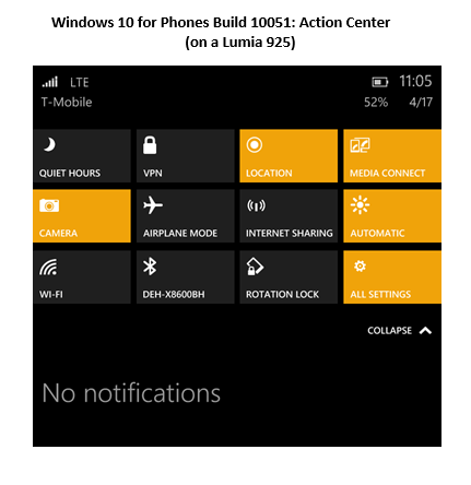
Action Center in Windows 10 for Phones builds upon what Windows Phone 8.1 introduced. Now, we have a full three rows of settings options which can be edited, bringing out all of the common settings we could ask for in a single swipe from the top. New text messages, emails, calls, etc still stack in the lower part of the Action Center as before, too.
The in-line replies option, which is brand new, where you can respond to text messages for example without having to leave your current app, is extremely useful. I found myself using it to reply to texts much more quickly without losing my place in my news apps or within RSS feeds, which was commonplace previously. It's a bit unwieldy at times, however, and doesn't always respond to the touch sequence normally used to stage a response. I'll attribute that to bugs on the preview release.
There is a new Alarms app in Windows 10 for Phones which features a new world clock view, along with a neat new timer, stopwatch, and a deeper array of alarm options. It's a quirky thing to be excited about, but I really like where the Alarms app is heading in the next release.
I did try out Project Spartan, the new web browser taking over for IE Mobile, and was fairly impressed with the rendering speed on most sites. The problem? The app is still way too buggy, and Microsoft seems to still place a lot of reliance on reverting back to IE in situations where I guess they predict Spartan wouldn't be able to load or render right. I wish Spartan was more fully usable as a daily browser to get an idea of what it can truly do, but it's still early as they claim.
As a very rough preview, the app seems to be coming along nicely, and offers a glimpse of how Windows on mobile will make further strides in bringing rendering equality to Windows Phone devices.
While still extremely buggy and slow, the new Maps app (a Universal App now) combines the previous feature set of HERE Maps and HERE Drive into a common single experience. Microsoft now uses imagery and data from Bing Maps and the Nokia HERE database to power the new Maps app experience. I find it refreshing to be able to rely on a single app going forward, which means a common UI and one place to go for any mapping or navigation needs.
I never liked the fact that mapping and driving was divided between the various HERE apps. They worked, but it was clunky to have to remember which app controlled which functions. It was one aspect of Google Maps which I missed. Well, that seems to be soon a thing of the past.
The Not So Great: Slowness; GPS Bugs; Lack of Office Touch
Windows 10 for Phones 10051 is in essence a technical development preview. As such, it was billed as buggy, experimental, and not-even-close to ready for primetime. And for the most part, I have to agree with these warnings. After one full week on the build, numerous things I grew accustomed to on Windows Phone 8.1, like a fast camera start time, OneDrive camera uploads, and swift autocorrect across all typing interfaces (in 10051, email has a complete lack of it) was broken or faulty.
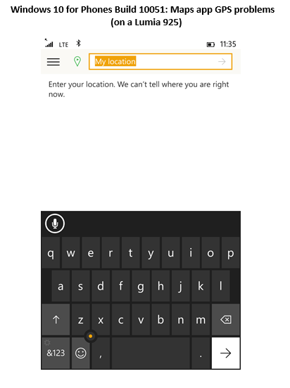
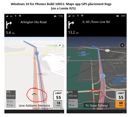
I'll start with perhaps the most frustrating issue I had with 10051: the Maps app. While I adore where MS is heading with the unified experience, the app is far from complete or functional yet. For example, when I had to rely on the app for numerous client trips during the week, I frequently had to tell the app where my location was, because it couldn't render my Lumia 925's GPS responses properly, as shown below:
Another related issue with the Maps app was an overall buggy experience with real time driving navigation. For example, the app would sometimes just refuse to have the live map follow my true position, but the actual distance from location would properly shrink.
Likewise, I had to deal with numerous trips where my cursor denoting car location on the map was all over the board, and at times, being duplicated off the road I was currently traveling on. Expected, I agree for a preview, but still caused me much pain during some important trips I had to make.
I happen to rely heavily on my camera app during the workweek, as I'm taking pictures of new client sites we are preparing projects for, or of what was done at jobs that are complete. I downright love the fact that my Lumia 925 has a dedicated camera button (newer Windows Phone handsets are dropping this... why?) and it seems that the speed of which the new app comes up is noticeably slower than before.
In addition, the native camera app (not Lumia Camera) has some strange bug where most of the live camera screen gets cut off into black upon entry, and just shows a copycat three-box replication of the camera's live view in a part of the screen. Again, a bug I most likely bet, but annoying that I couldn't test out much of the new Camera app experience.
It's hard to tell if Microsoft is including much of the speed improvements that some of the latest Lumias got with the Denim firmware, but here's hoping my 925 can get some of it once Windows 10 for Phones goes officially live.
Another rather perplexing aspect of Windows 10 for Phones 10051 is its rather peculiar choice on UI placement and navigation area bloat, for lack of a better phrase. On Windows Phone 8.1, space wasted due to menu areas and title bars was minimal, but on this release, big offenders like the new People app just completely lose the balance of core content space and "supporting" area space.
For example, take a look at the new People app and its choice of space designs:
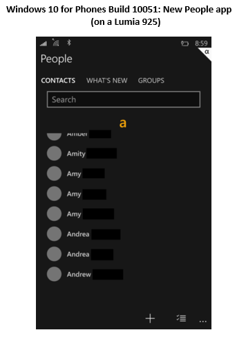
If I had to guess, I would say that a mere 50-60% of the screen is showing actual content, and the other portion is all wasted to increased search bar area, a large header area for the spot of the address book you are in, and a completely nonsensical bloated lower area. With some phones that have screens on the smaller side like my Lumia 925, why would Microsoft give away so much real estate to nothing?
It would be nice if there was an option for an expanded view, as seems to be the case now in the People app, or for a collapsed, more dense view, akin to what Gmail offers for its web interface users. I have great eyesight still and don't need such large text or navigation areas. I would much rather have more "at a glance" data on my screen at once so I don't have to scroll as much.
Another area which I rely on heavily in Windows Phone 8.1 is the divided email count between accounts, personal and work, on my lock screen. Windows 10 for Phones seems to have this feature busted, as they refused to work as I remember them. I thought I adjusted my settings properly to have it how I liked it previously, but it never functioned right.
I'm confident this will be usable once again once it hits final form, and here's also hoping Microsoft will allow Outlook to have separated inbox tiles on the Start Screen like we do on 8.1. Currently, Outlook mail on 10051 is a single tile that doesn't even show live mail counts, let alone counts per inbox. This is a BIG feature that needs to be kept.
Similarly, Windows 10 for Phones has other odd UI bugs, namely with overall icon sizing and some issues in the text sizing arena, too. For example, some notice screens that come up from the top of the phone, are downright disproportional in the text size choices. The main title of the message will be largely obese with supporting text below is that is far smaller. It may be a bug or temporary, but it's far from elegant or clean, as per what I would expect on Windows Phone.
Another new feature in Windows 10 for Phones is the unique "trackpoint" cursor you can use in text areas to move around within words that was otherwise a chore in "whack a mole" taps to try and get the correct placement. While the idea itself is novel and welcome, the actual execution of the trackpoint feature is still strange.
Many times, when trying to use the trackpoint, I found that it either didn't respond at all, or took way more lateral movement of the finger than seems warranted to initiate the feature's up/down or left/right positioning. I would expect for the option to be slower on movement at first, with more motion causing a faster cursor jump, but this isn't the case. Moving your finger just slightly in the direction you want it to go, or much further out, gets the same result, which just doesn't feel intuitive as it should.
As a longtime Thinkpad user, now on a T420s, the trackpoint is something I'm well accustomed to. Microsoft should take some cues to how Lenovo implements the trackpoint on its laptops, as the function should similarly smooth in operation on a smaller phone screen.
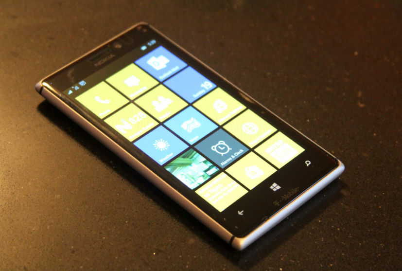
This Lumia 925 has been my primary daily phone for work and personal needs since late 2013. It's probably the best smartphone I've ever used. I'm considering moving to a BLU Win HD LTE, as Microsoft doesn't have any excellent flagship Windows Phone devices on the roadmap... yet. How long do we have to wait for a proper Lumia 925 successor, Redmond?
Overall speed and responsiveness of the preview release is a mixed bag. At times, my 925 behaves on par or a bit better than on 8.1, but at many other times, apps are "Loading..." incessantly, or just downright crash and exit. Cortana on this release is a big culprit, and I couldn't use the app very much without the app closing out on initial searches.
Bluetooth functionality was also a bit on the awkward side with the preview release. In my car, there were numerous times where I would either have choppy audio on Pandora or on a Lync call that would stutter, and at other times, Bluetooth would show as connected but no audio would flow through. The only way to overcome this would be to completely shut off Bluetooth on the phone and turn it back on for a reconnection.
Will Windows 10 for Phones Win Over Android/iOS Converts?
I think the next release of Windows on phones will be an interesting mix of the familiar positives from Windows Phone 8.1, with a breath of fresh air in the right areas. Those who don't care for Live Tiles or the Start Screen won't have much better feelings about the new OS, but for the rest of us who enjoy reprieve from the usual drivel of the Android/iOS UI, Windows 10 for Phones is going to be a solid upgrade.
Microsoft needs to patch up the areas of Windows 10 for Phones that will matter most on final release. First off, the concept of Universal Apps needs to come together full circle, namely with the release of the expected flagship apps including Office Touch and Outlook Mail/Calendar. And Microsoft shouldn't expect to merely match the level of quality of these apps that exist on competing platforms -- Windows 10 for Phones needs to have the best experience. Best on Windows should still mean something.
The expected set of bugs and sluggishness need obvious attention as well. As a daily use OS, the release is far from what most people can swallow. As a technical expert, I was willing to swallow a week of functionality to experience the bleeding edge. But I really want to see Microsoft release more stable, feature-complete builds that will be able to showcase what users can truly expect upon release.
While I'm moving back to Windows Phone 8.1 for daily usage for the time being, I'll be on the lookout for the next (more stable) builds of Windows 10 for Phones.
Here's hoping Universal Apps and a common experience across all Windows devices will tide more Android/iOS holdouts over. But to compete better in user share, Microsoft needs to differentiate the benefits of Windows 10 for Phones over the competition. That's where this great platform will truly be able to organically grow beyond its niche user base.
