How to customize Windows 10 Build 10061's new Start menu

The new Start menu included in the latest build of Windows 10 -- available to Windows Insiders on the Fast ring -- is a marked improvement over previous versions. It’s resizable, and customizable. It’s also, like the build itself, rather buggy. It’s a bit like a fair-weather friend -- sometimes it’s there for me, other times it’s nowhere to be seen. Hopefully the issues with the menu will be sorted shortly.
If you’re running the new build, or planning to, then it’s worth customizing the Start menu to suit your tastes. There’s quite a lot you can do.
The obvious first step is to resize the Start menu. You can do this by clicking and dragging on the edge of the menu. You call pull it upwards, or sideways. The tile groups reposition themselves automatically. You can also expand the menu to full screen by clicking in the top right-hand corner. The tiles themselves can be resized via the right-click context menu. You can also reorder them by clicking and dragging.
Some changes can be made to the menu’s behavior by right-clicking the taskbar, and opening Properties. Click the Start Menu tab, and from here you can manage privacy options, choose the number of recent items to display in Jump Lists, and show suggestions in the Start menu.
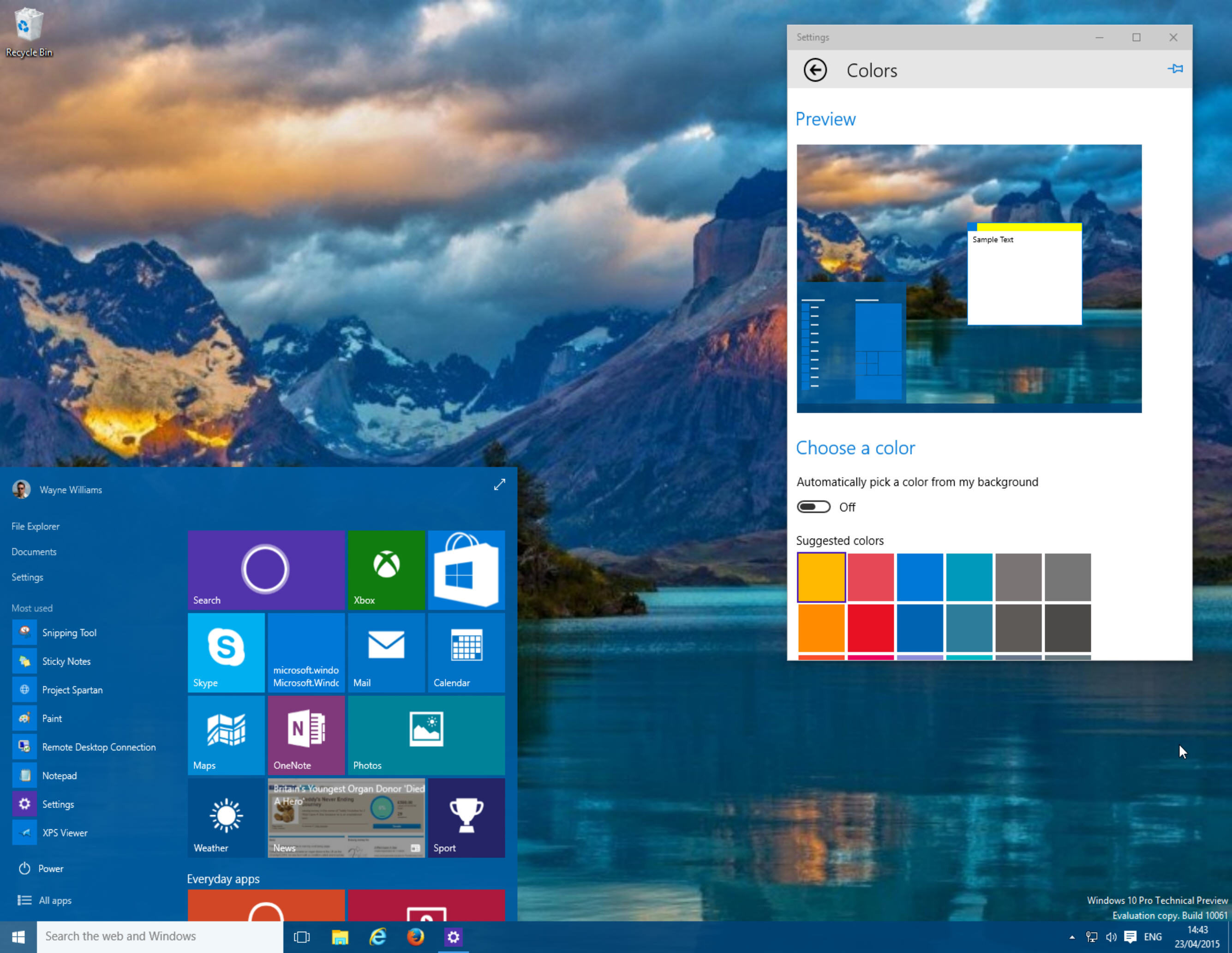
In the new build, AutoColor is enabled. The Start menu will pull its color scheme from your Windows wallpaper. To change this -- to choose the colors for yourself -- click the Settings link, and then click Personalization. Click on Colors.
To disable AutoColor, turn off the "Automatically pick a color from my background" option. Windows will display a grid of colors you can use instead. Select one, and the thumbnail above will preview it. The color scheme will also be applied to Windows itself, so you can see the changes for real.
Scroll down, and you can choose whether or not to show this color on the taskbar and Start menu. If you turn this option off, you’ll get the standard dark theme.
The Colors screen also lets you enable or disable the Start menu transparency effect. Personally I like the effect, but a solid block of color works well on some desktops.
All of the changes are actioned immediately, no need to click on an "Apply" link or button to make them.
In the very first build of the Windows 10 Technical Preview, removing all of the tiles from the Start menu caused it to shrink down to a Windows 7-style tile-free design. What happens if you do the same thing in the new menu? You end up with a lot of blank space where tiles should go. This will hopefully be fixed in a future build.
