First look at iOS 9 and OS X 10.11 El Capitan public betas

Apple has released the first public betas of iOS 9 and OS X 10.11 El Capitan, allowing anyone with a compatible device -- iPhone and/or Mac -- to become a tester. Having signed up for the beta program last month, I immediately wanted to experience what is new in the upcoming versions of the two operating systems.
There is huge demand for the first public betas, proof being that Apple's servers were quickly overloaded during the first hours of availability. You can thank the media frenzy for this. Nonetheless, I have managed to install the iOS 9 and OS X 10.11 El Capitan public betas on my iPhone 6 Plus and 13-inch MacBook Air, respectively. And here are my first impressions.
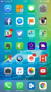
Since my first contact was with the iOS 9 public beta, I will start with it. The first thing that I noticed, and likely the first thing that most users will notice as well come its fall release, is the new font that Apple has opted for. I have mixed feelings about it, not knowing whether it helps readability or the overall aesthetics.
 There is also a new available background, which I applied on both the lockscreen and homescreen. This one is quite nice. This is not the only thing that is new while browsing the Settings menu, with Apple making some welcome changes in this area. The cellular settings are better grouped now, the battery information gets it own dedicated sub-menu which exposes a battery saving option, there is now an option to auto-lock the device after just 30 seconds (the previous-lowest was one minute), and new Siri-related options.
New features that you have read about for iOS 9 beta 3 are present in the public beta, including the high-quality streaming option over cellular for Apple Music. You can hide Apple Music in the Music app, which is an interesting choice that Apple is giving. It looks like iOS 9 will be the least-restrictive iOS release yet.
While switching apps I noticed that there is a new transition used, and an easier way to go back to the previous app -- a "Back to App X" button shows up in the upper left corner of the display -- which is a welcome touch as well.
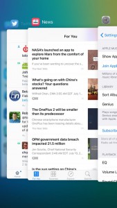
 What I do not like about multitasking and switching apps is the new multitasking menu, which now shows apps stacked on top of each other instead of next to each other. There is too much focus on a single app. You can, however, still close multiple apps at the same time by swiping up with three fingers. And it looks prettier, which is a good thing in my book.
Spotlight can now be accessed the old-fashioned way again, by swiping to the right on the homescreen. It can also be triggered the iOS 8-way, by swiping down on the homescreen. There is a difference to note about the two ways to trigger Spotlight -- the former doesn't automatically pull up the keyboard for you to go straight to typing something, but the latter does.
I have quickly looked at the News app, but have not yet managed to give it a proper run-through. It looks very much like Flipboard, after playing with it for a brief period of time. I believe it will be popular with iOS 9 users but I, personally, would much rather keep using the no-frills News Digest by Yahoo in conjunction with Feedly.
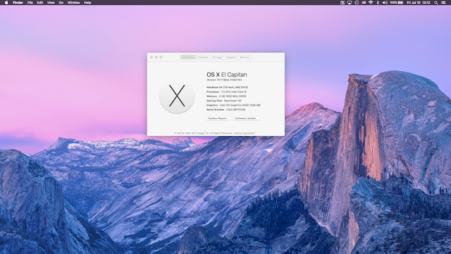
When it comes to OS X 10.11 El Capitan, there are fewer changes to notice at first glance. It too features a font change, which gives me the same mixed feelings as its iOS 9 counterpart. I suppose it is a matter of getting used to it, but the benefits are, again, not immediately apparent.
There are not many changes in the Settings, except in the App Store menu where OS X 10.11 El Capitan now makes it easier to install free apps, by allowing you to store your iCloud password for free downloads, and automatically update the OS and apps.
One of the first things that I have wanted to try on OS X 10.11 El Capitan is the new window management, similar to Snap in Windows 8.x. I had to look up how it works, which does not make it as intuitive as I would have liked.
You have to long-click on an app's green maximize button to be allowed to snap it to one side or the other on the screen. However, this seems to work just on the monitor the app is active on, as I was unable to snap it to another monitor. So, I reverted to the old method, which is using Cinch, that works better at the moment.
So far, I have to say that I do not regret installing the public betas, but, given that they are not anywhere close to the final releases, only time will tell if they will be stable enough to keep me from downgrading to iOS 8.4 and OS X 10.10.4 Yosemite.
