Google launches Data Gif Maker so you can create animated GIFs to illustrate data

As names go, it's clear that little thought went into Google's new Data Gif Maker. It's a simple tool that lets you create animated GIFs to compare statistics about two different topics. Google says the free tool is aimed at journalists, but anyone with a website is able to use it however they want.
The idea is simple. Rather than just saying Android is more popular than iPhone, you can let a graphic do the work for you. Data Gif Maker produces bar charts that we have all become familiar with during elections, giving an easily-interpreted visual representation of basic stats -- but these are animated to make them more eye-catching.
Before you get to anything approaching excited, keep in mind that this really is simple. On top of that, the animation doesn’t really serve any purpose -- or at least it doesn’t really add any value for the viewer beyond getting their attention.
The online tool can be used to create up to five comparative visualizations in a single animation: such as the number of Republican votes compared to Democrat votes, the number of politicians for and against a particular policy, and so on.
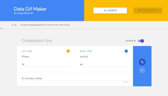
Creating a data GIF takes moments. Just enter your two terms for comparison, choose a color for each bar, add the numbers or percentages you want to present, and add a description. That's it. Repeat for up to four more comparisons if you want to; if you create more than one as part of the same animation, they'll just be cycled in to the finished product. You can then opt to download your creation as a GIF ready to use online.
Check it out at the Data Gif Maker website.
