How to avoid Twitter's bubbly redesign

With its latest redesign, many people are complaining that Twitter has stepped back in time. If you are not a fan of the "circles and curves everywhere" look, you can -- with a little help -- avoid the redesign and stick with the way things were.
There's just one catch -- you have to be using Chrome. If this is already your web browser of choice, all you need to do is to install an extension built specifically to "remove Twitter's 'bubbly' redesign."
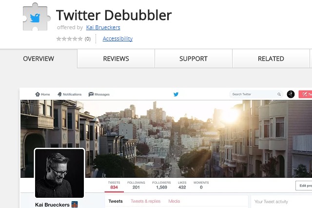
The aptly-named Twitter Debubbler banished the rounded corners, the circular profile picture, and the other "bubbly" aspect of the redesign. Produced by Kai Brueckers, Twitter Debubbler is a quick fix for those who are unhappy with the curvy direction in which Twitter has headed.
Head over to the Chrome Webstore to grab yourself a copy of the extension. Once you have it installed you'll find that your profile picture returns to its previous square state, rounded corners vanish, and the new icons are banished.
Which look do you prefer?
